Particle, a men's skincare brand rebuilt from the ground up — science-driven, effortlessly refined, and unmistakably masculine.
To rebrand a men’s self-care line into a high-performance, results-driven identity — one that bridges the gap between clinical efficacy and everyday simplicity, giving men a brand they can trust without the noise typical of the category.
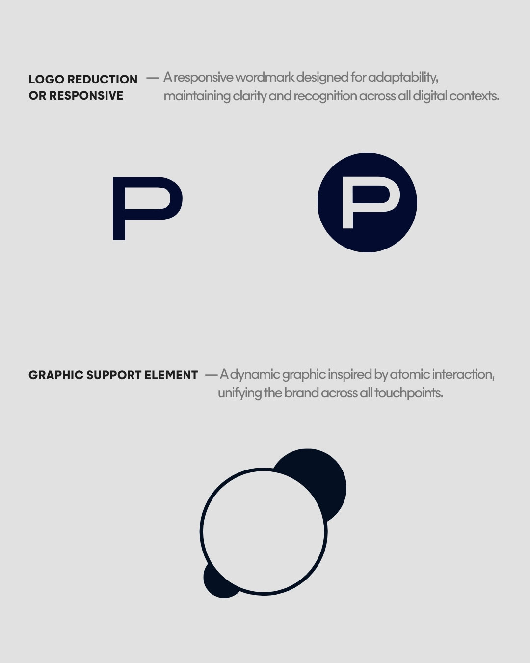
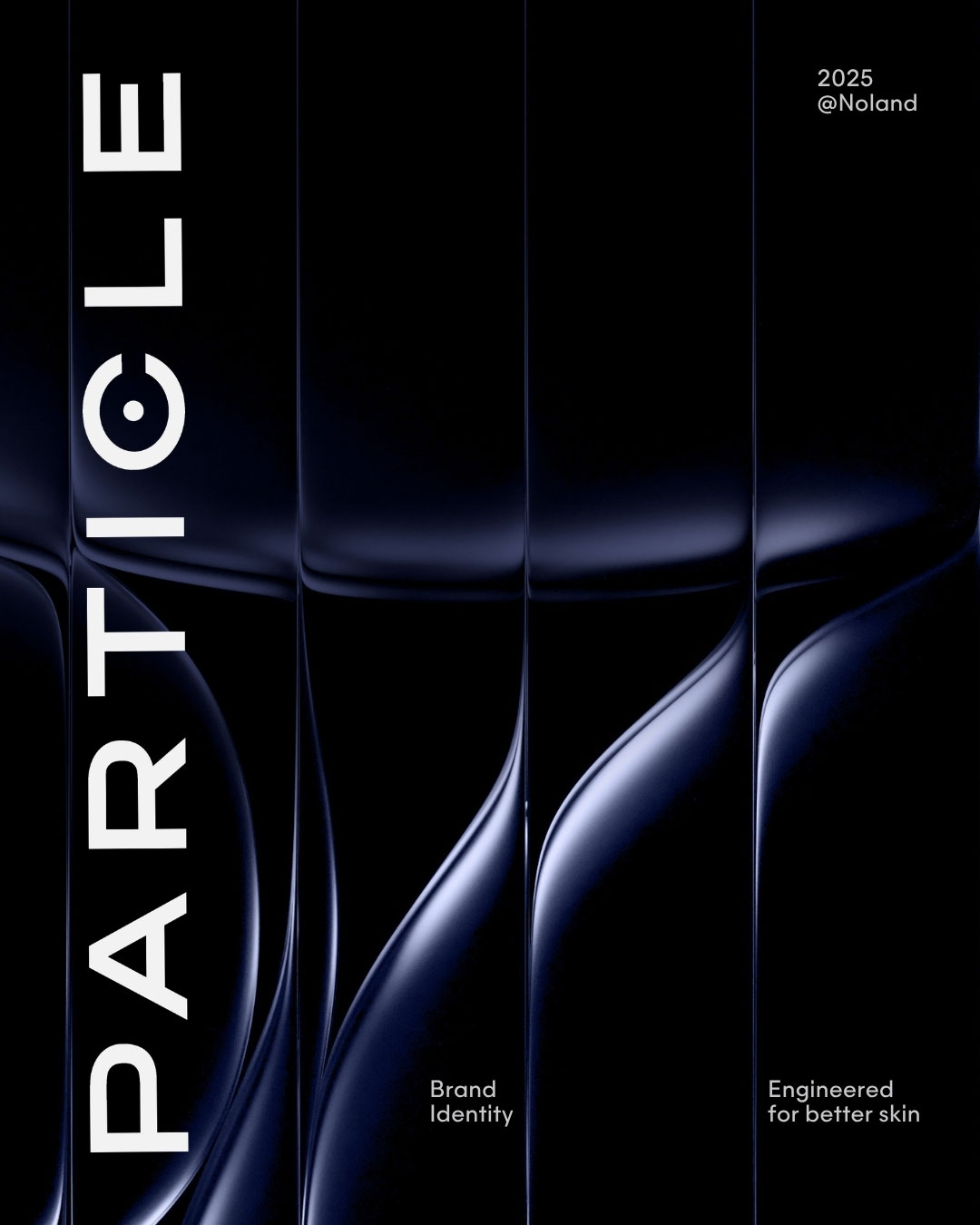
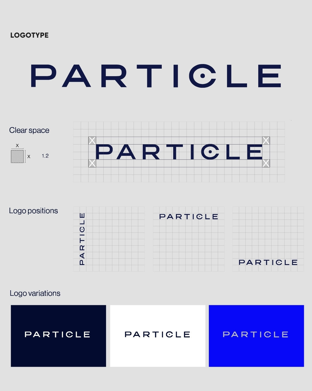
The idea starts at the smallest scale: the particle. A single dot orbiting the logotype’s “C” becomes the brand’s core symbol — two overlapping circles that evoke atoms in interaction, a nod to the science and precision behind every formula. It’s a mark built to feel clinical and confident at once, echoed everywhere from the wordmark to the packaging closures.
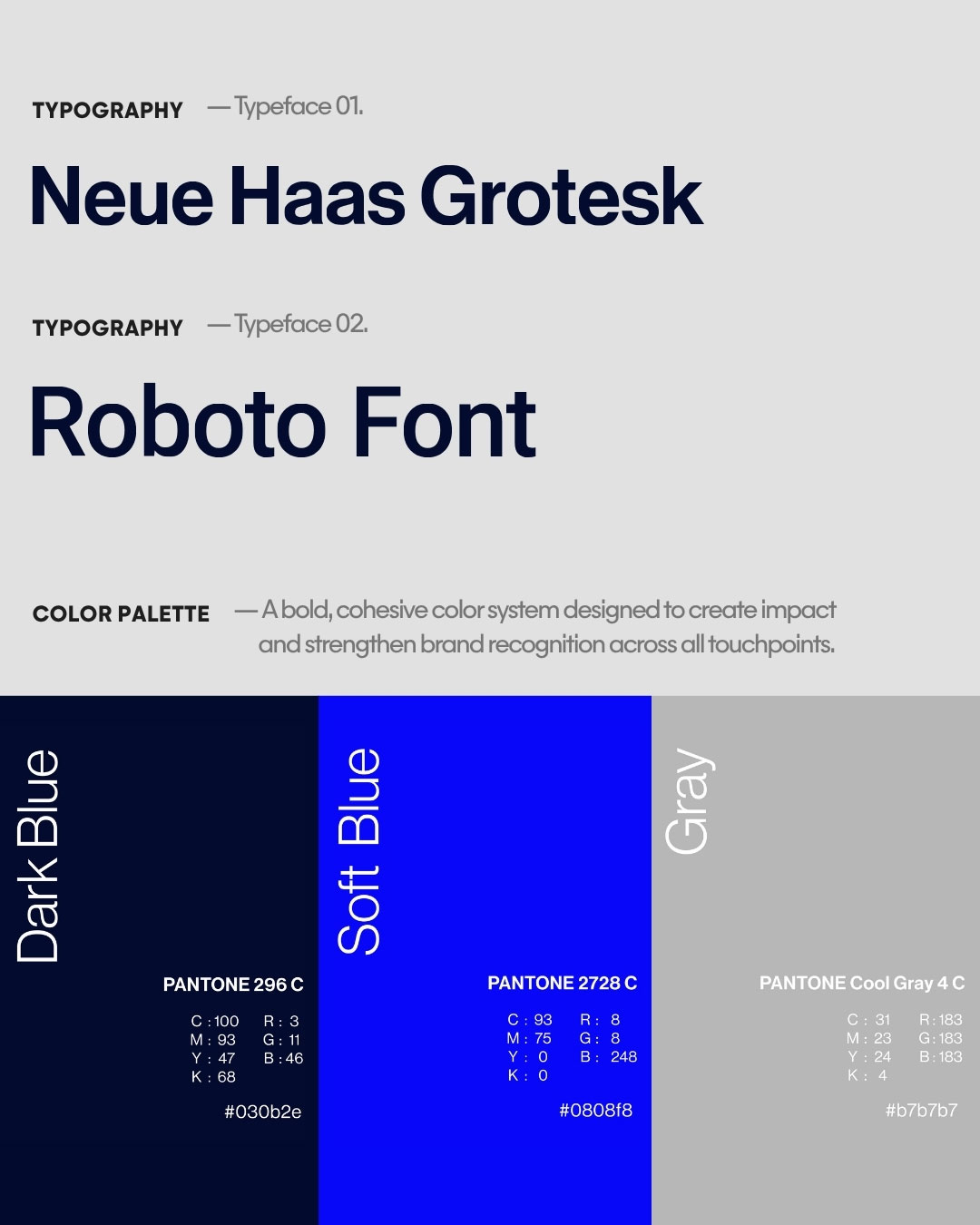
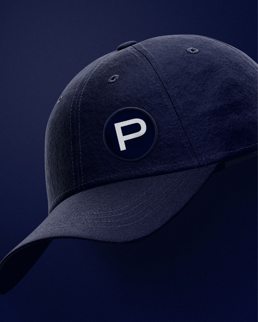
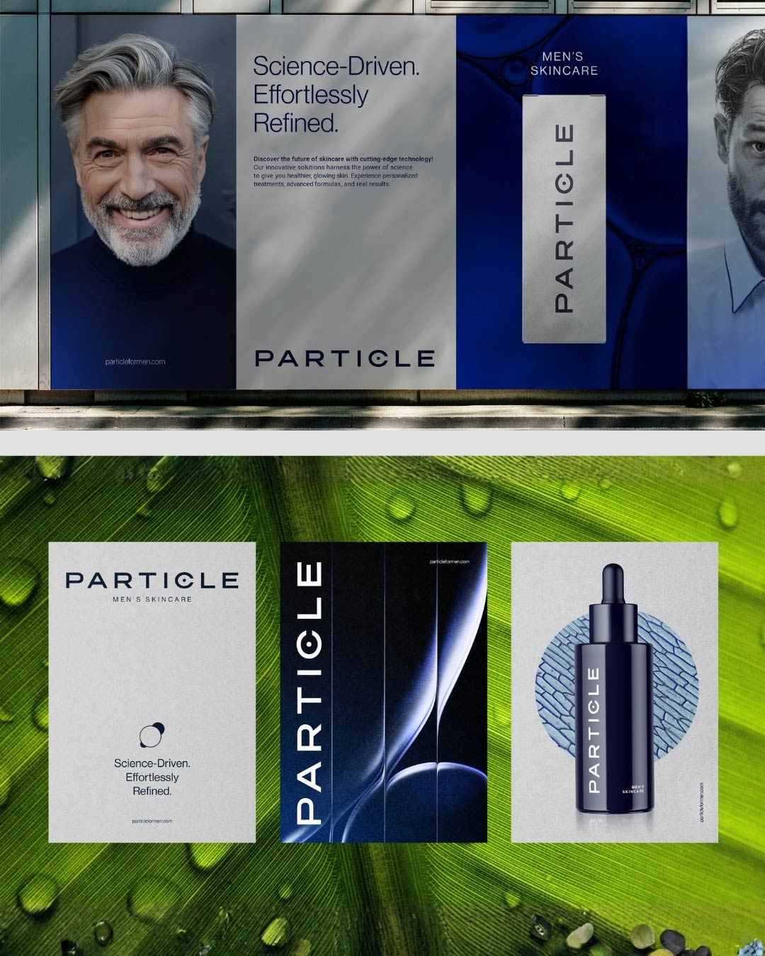
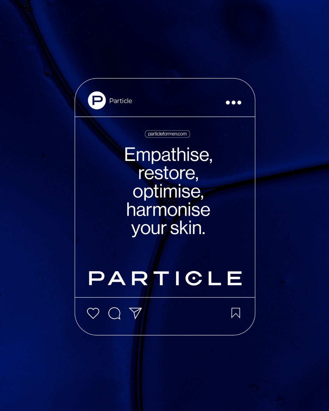
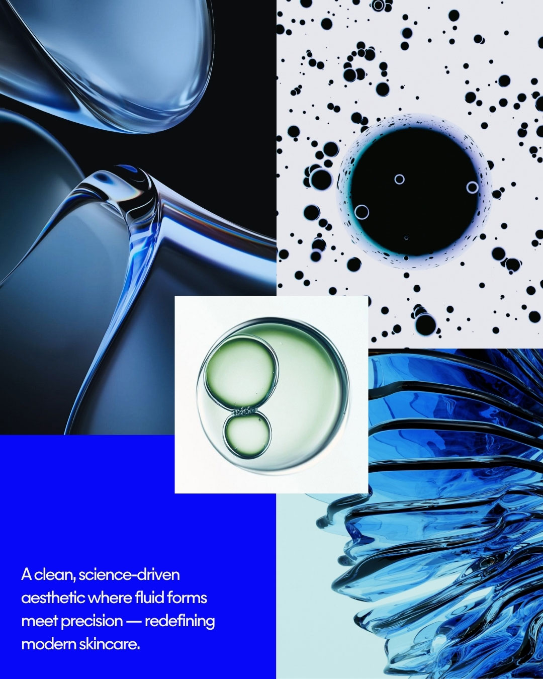
The identity centers on a clean, minimalist wordmark set in tight, architectural type, paired with a bold Dark Blue and Soft Blue palette grounded by cool gray — masculine, clean, and built for impact across print and digital. Neue Haas Grotesk carries the brand’s voice in headlines and packaging (“Science-Driven. Effortlessly Refined.”), while Roboto handles the functional, everyday touchpoints like web and email. The atom-inspired graphic motif recurs as a secondary identifier throughout, unifying everything from social content to product photography with a consistent, tech-forward visual language.

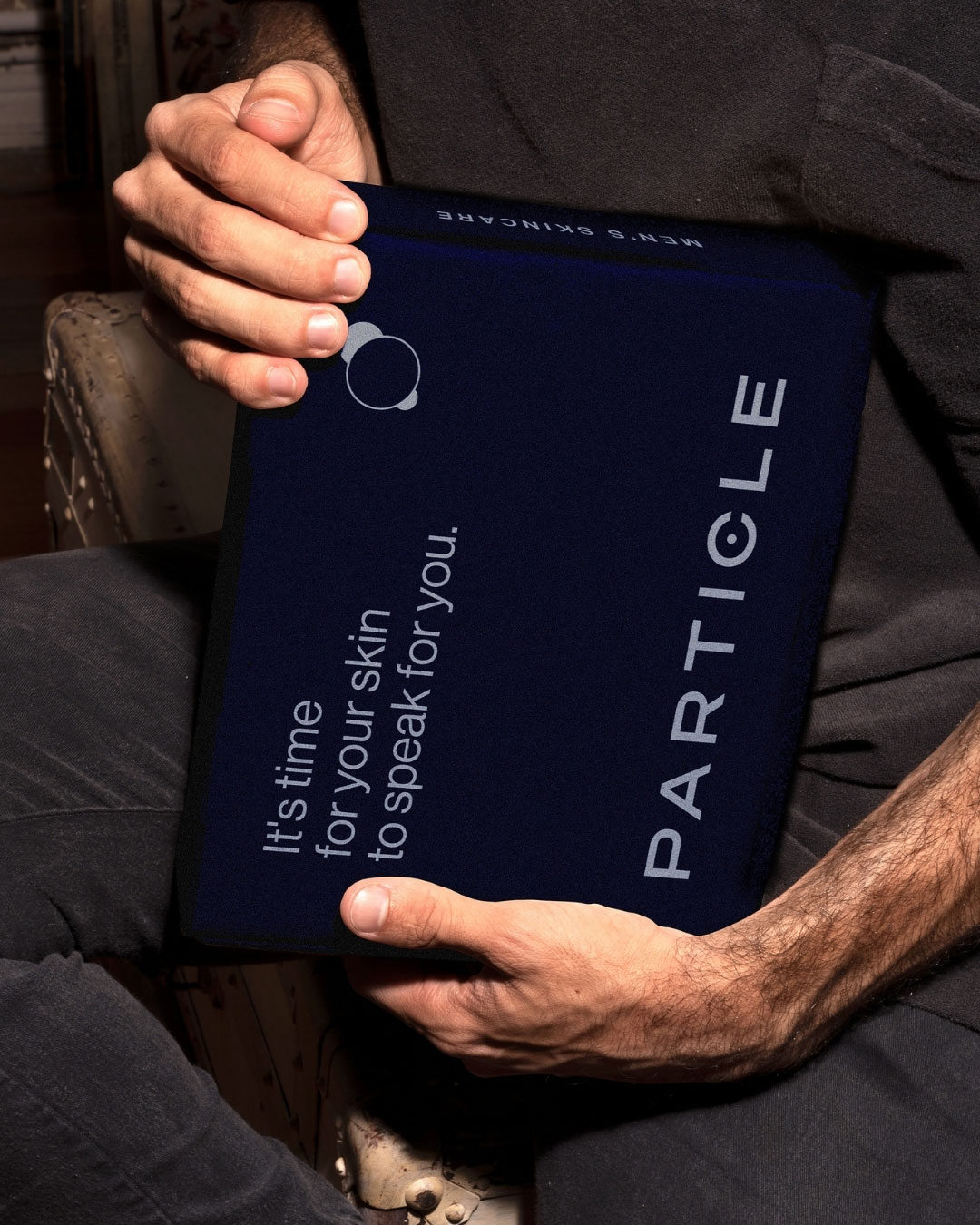
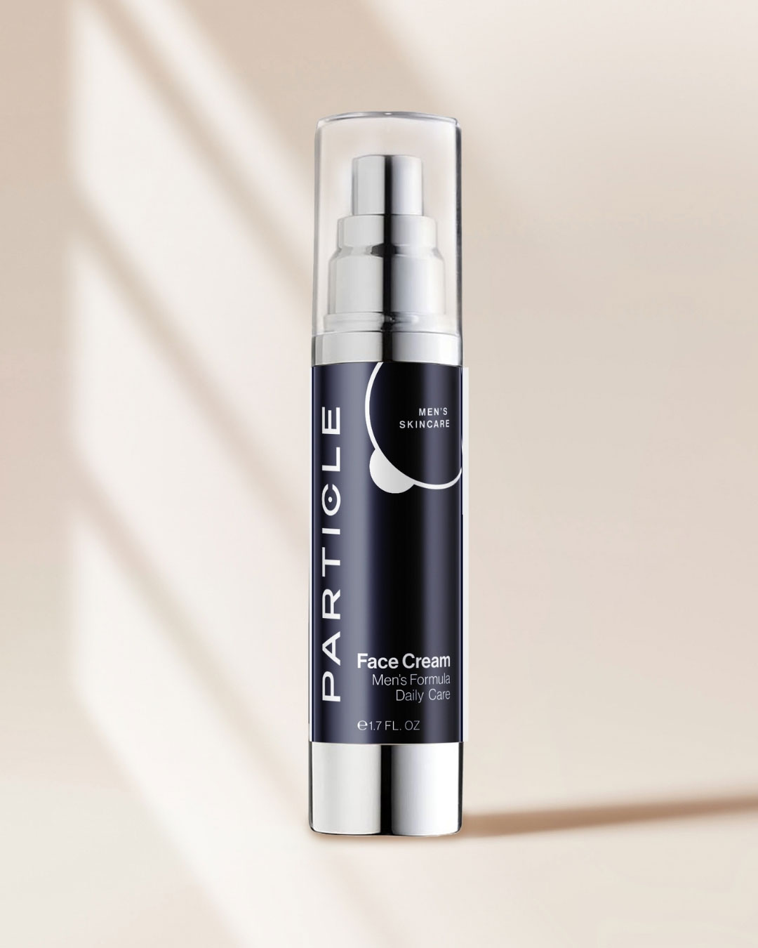
Packaging translates the brand’s scientific positioning into something tactile: navy bottles and cartons with brushed-metal caps, the wordmark running vertically along the body, and the particle symbol embossed or foil-stamped as a quiet mark of craft. The result reads closer to an aesthetic lab than a drugstore shelf — premium, restrained, and clearly formulated with intent.
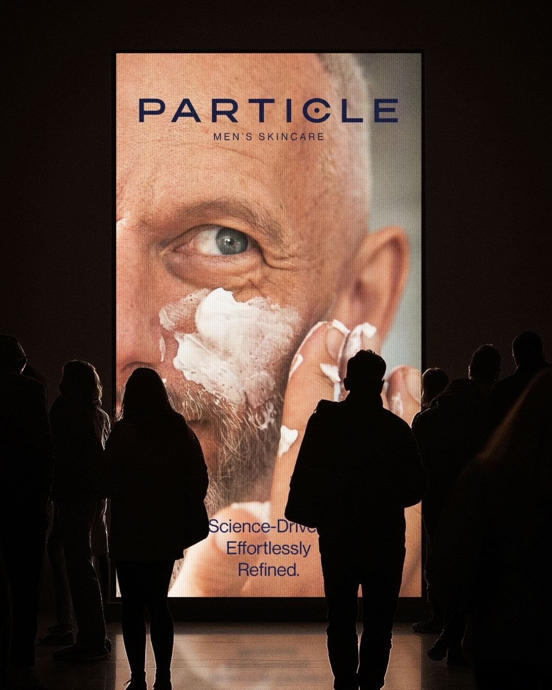
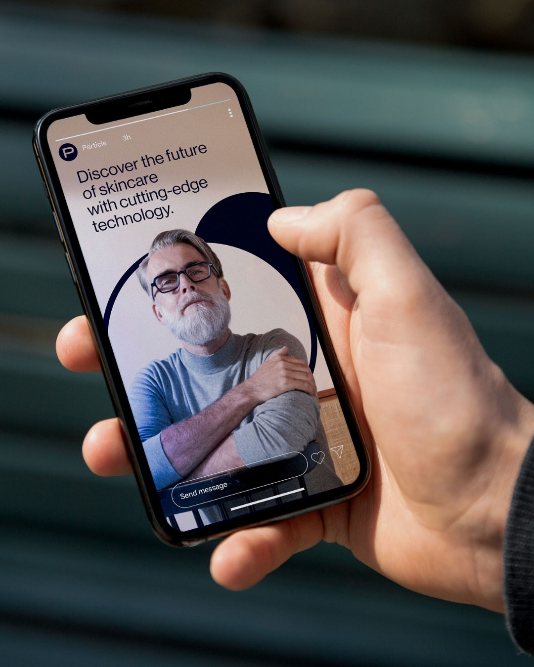
The rebrand extends into out-of-home, social, and retail placements built around the same tone: confident headshots of real men paired with spare, declarative copy (“A man with healthy skin,” “It’s time for your skin to speak for you”). Billboard, Instagram, and window-display executions all share the same navy-and-blue palette and clean typographic hierarchy, giving Particle a consistent, premium presence wherever the customer encounters it.