Thameen, a Kuwaiti bukhoor house reimagined for a new generation of luxury — modern in expression, rooted in heritage.

To modernise and elevate a heritage Kuwaiti bukhoor brand for a new generation of luxury consumers, while staying true to the culture and craft it was built on.

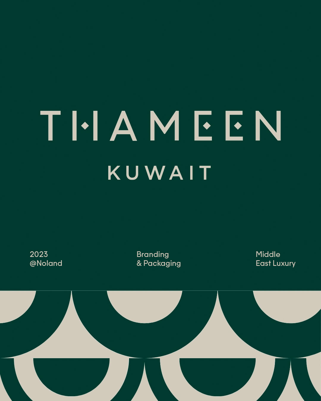
We looked to the Arabic alphabet itself — the diamond-shaped dots that punctuate its script — as the seed of a new visual language. A subtle, symbolic gesture that speaks to heritage without illustrating it literally.

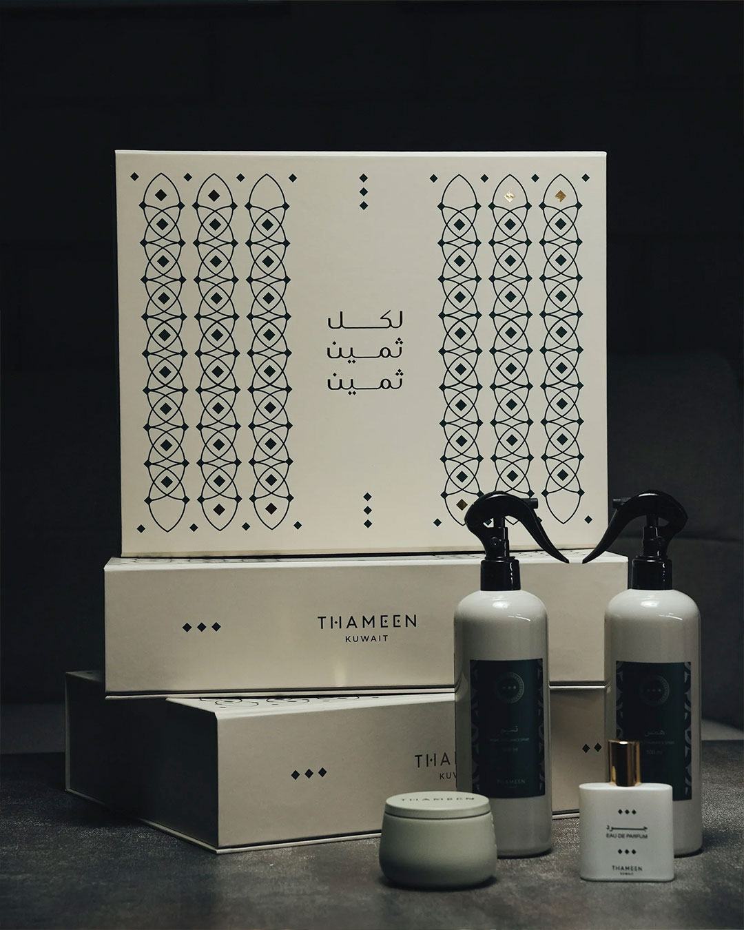
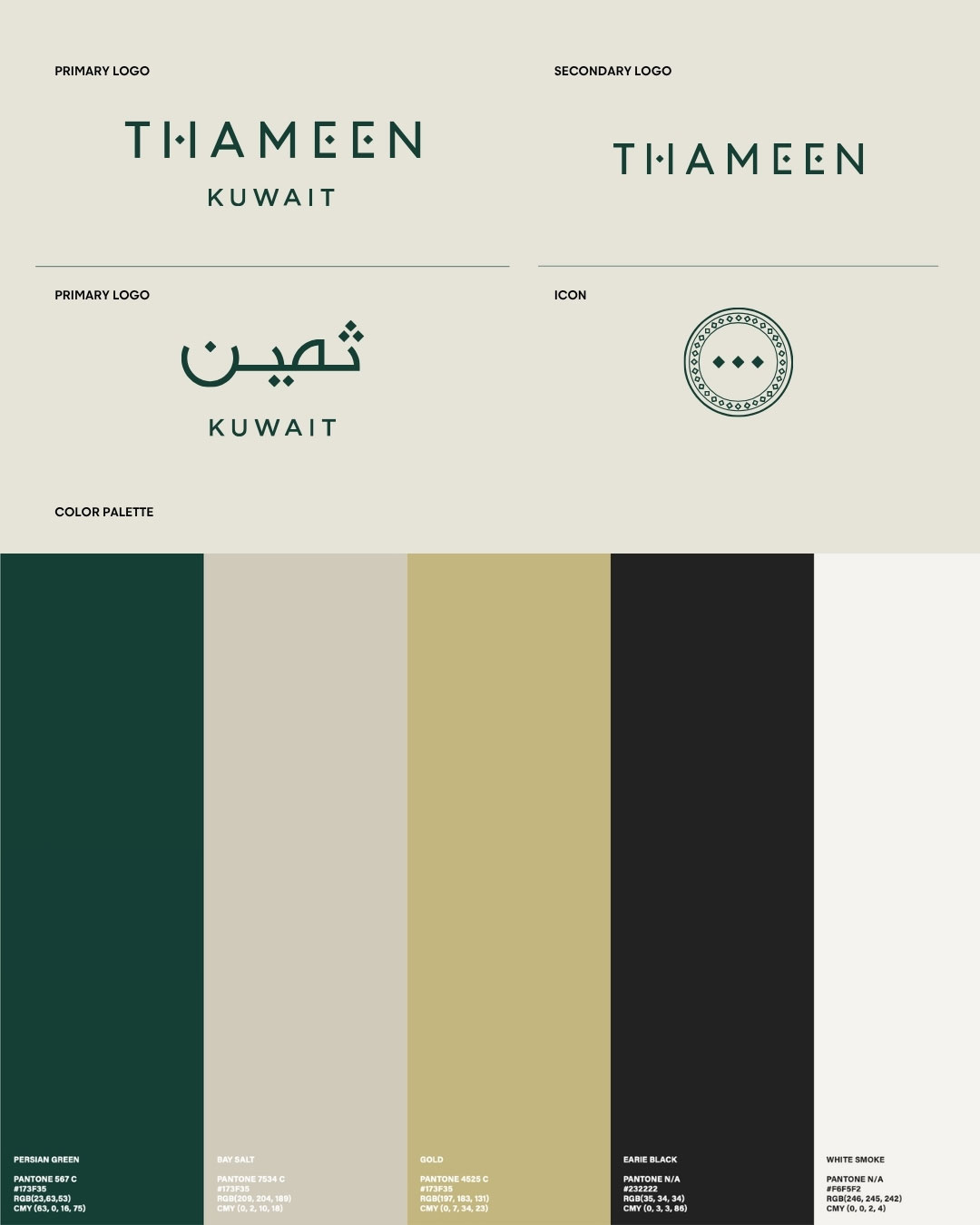
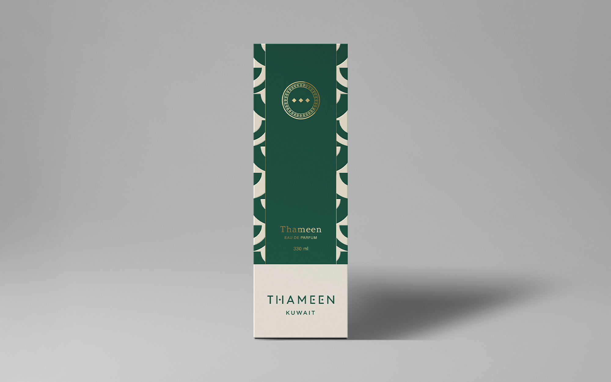
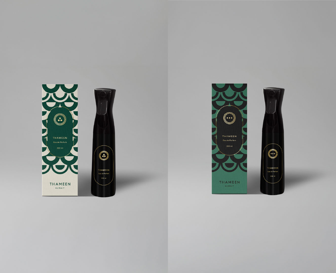
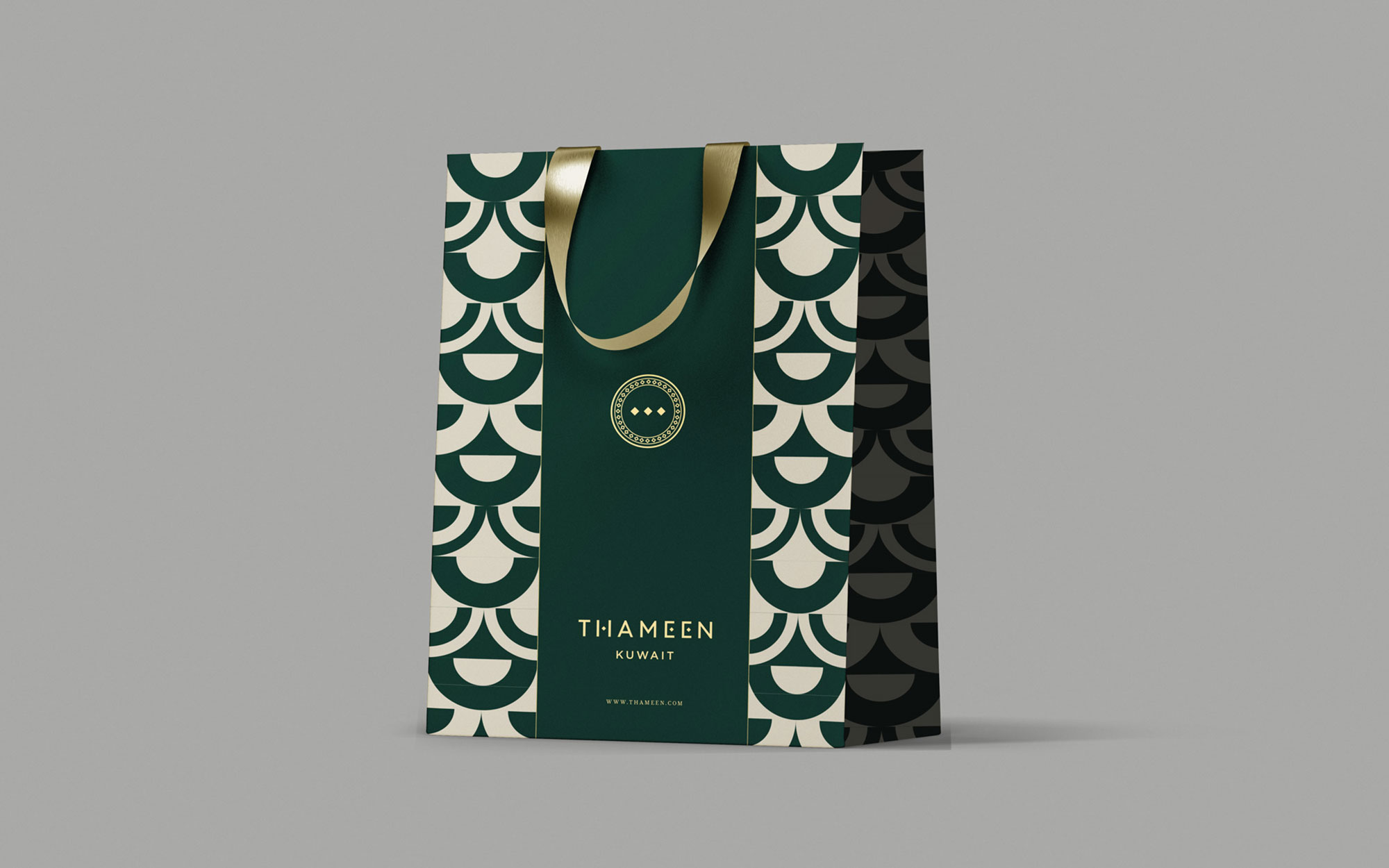
The result is THAMEEN: a logotype built from clean architectural lines, with diamond characters standing in for the dots of Arabic script. A palette of Persian green, bay salt, and gold brings warmth and gravitas, while a scalloped geometric pattern — drawn from traditional motifs — gives the brand a signature texture that carries across every touchpoint.

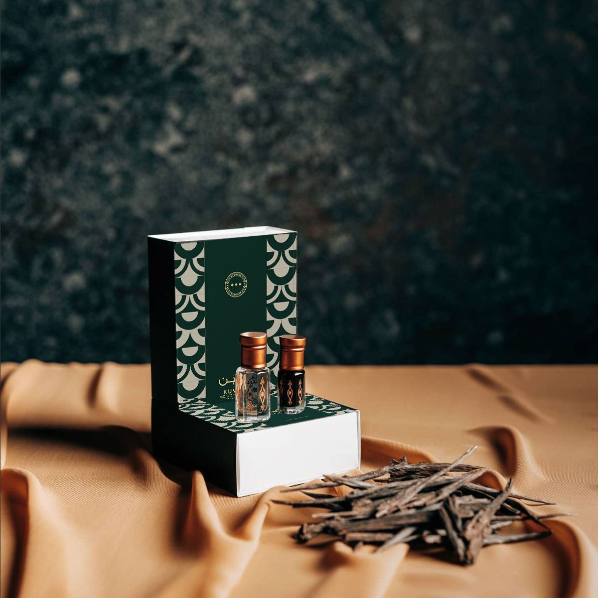
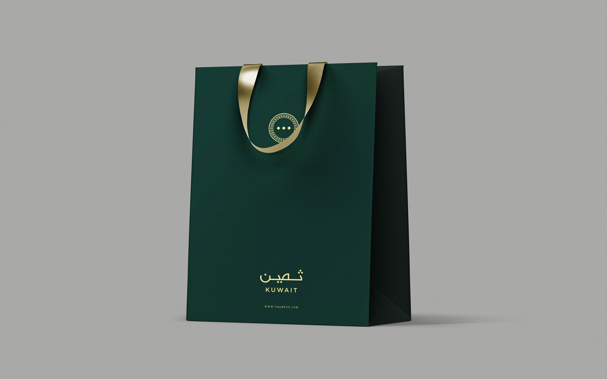
Packaging became the brand’s most tactile expression of luxury: deep green outerpacks finished in gold foil, pattern-rich shopping bags, and a stamped emblem that nods to craftsmanship and provenance. Neutral, pattern-free exteriors let the brand’s inner world take center stage — a considered contrast between restraint and richness.

A refined digital experience extends the same balance online — dark, editorial layouts and considered pacing that let the product, and the story behind it, breathe.

More projects