“Form follows function” is a classic, if not outdated, axiom for design. Nevertheless, as creative food packaging becomes a more prominent way to communicate our values, we could argue there’s a modernised version of this quote that we can apply, one that addresses “symbolic function”.
A standout food packaging informs not only your environmental and sustainability concerns, but the context in which that meal or beverage are going to be applied. Preparing and sharing a meal has been an essential ritual since the beginning of time. It tells us how much we care about other people and ourselves. It’s a moment for entertainment, but also sharing and reflecting. So it’s not surprising how brands and consumers have been recently trying to step up and apply this ancient mindset to our modern times.
On top of that, there’s the eternal question of sustainability and waste concerning single-use plastic containers. Ecological, reusable packaging might not be the end-all-be-all solution for climate change, as science shows there’s little impact that we can make as consumers. But for brands, signalling that concern through creative packaging makes a big difference. It makes us trust the brand and feel like we’re walking together towards a better future.
So today we’re going to show some examples of food packaging that exemplify some aspects of this new philosophy: “form follows symbolic function”.
Reusable, mindful and ready to show!
Is it possible to have it all? To reduce the eco footprint of a product while radiating a sense of harmony? TakeBack is classy, cost-effective and enviromentally-friendly. This creative food packaging, reminiscent of the Asian pagodas, can be cleaned and re-used. It’s also designed to preserve heat thanks to a double-walled construction, preventing meals to be reheated and thus saving energy in the process.
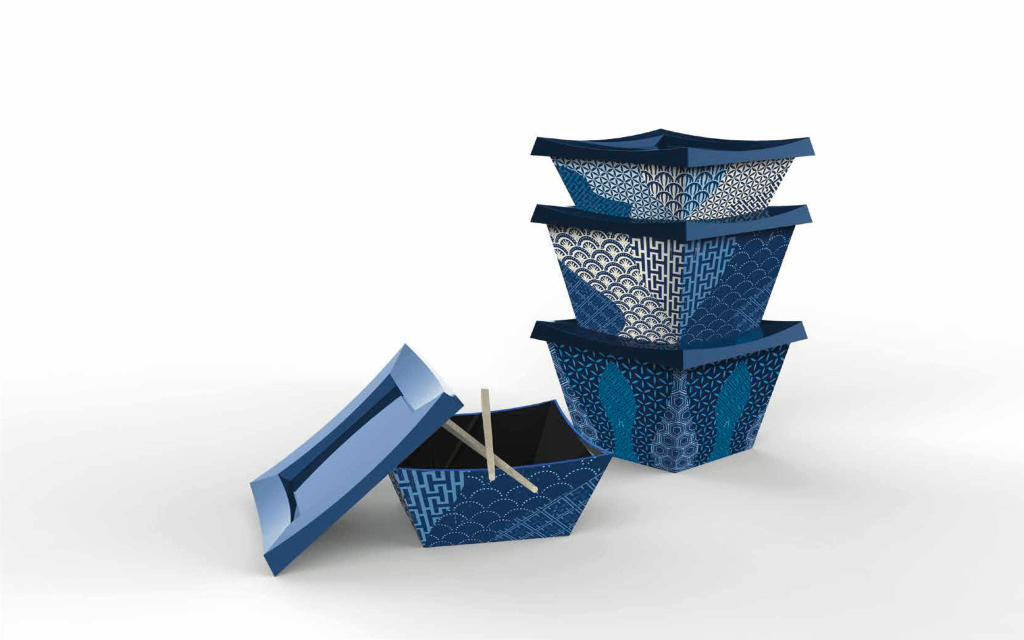
Most of all, this beautiful design is thought to be placed proudly at the dinner table. And, after your meal is finished, you can stack it up and wait for your next delivery to return the package.
As food packaging design keeps evolving, companies are striving to showcase the cultural nuances of each meal while at the same time being mindful of the environment.
It’s all about the experience!
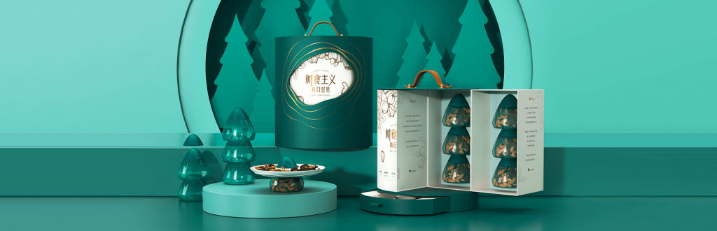
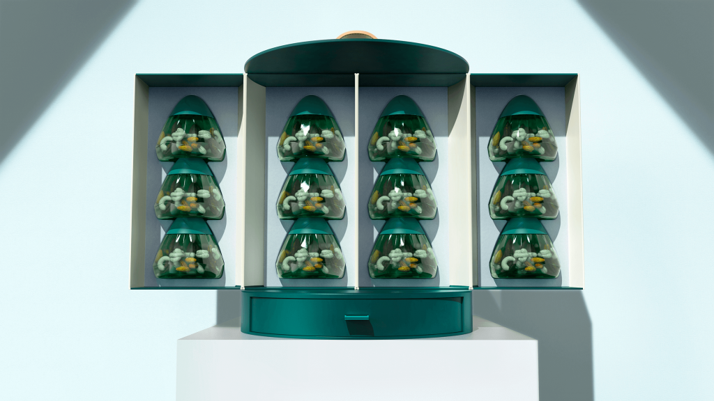
Nuts. Such a “basic” snack normally doesn’t get a showcase like this. But this gift-box enhances product packaging and turns it into a whole experience. From the outside specialty paper cover to the jars themselves, every step of the process is design to make you reflect through your senses about the importance of nutritional supplements in your life.
This product also emphasises sharing with other people. And, at the end, the nature of the package turns into a lasting memory, as every element can be used to create a beautiful desktop storage. ChaCha’s Nutsism Daily Nuts Gift Box is hand-made, luxurious and made to stay in your thoughts forever.
The power of storytelling through creative food packaging
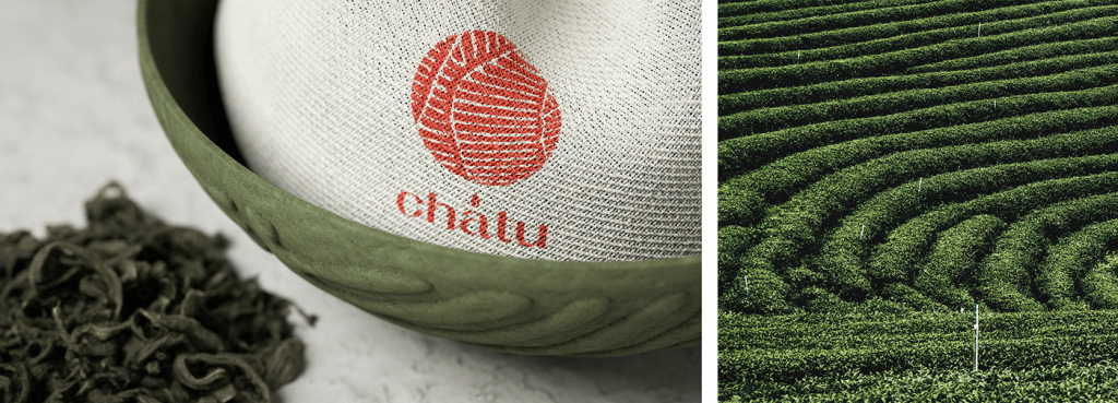
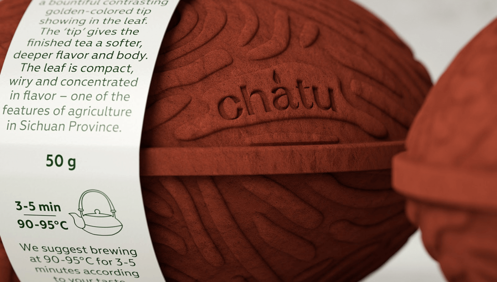
Chatu is a concept tea brand with a creative food packaging that draws inspiration from the plantations of Fujian, Henan, and Sichuan, China, where they source the tea from. You can tell how the design reflects the whole process of manufacturing the product, from growing to brewing, in a very elegant way with a sustainable edge: the swirls on the packaging mimic the hilly landscape of the Chinese tea plantations; inside, a breathable textile bag holds the tea, a sustainable alternative to plastic sachets that are reusable and easy to repurpose at home.

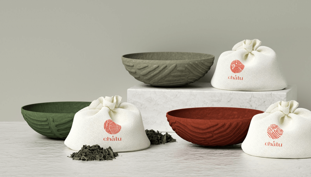
Every brand has a story worth telling, and certainly the key is to find a way to express it, evoking emotions, building connections and, in turn, creating an unforgettable experience. Chatu Tea absolutely nailed it, and as if this wasn’t enough, they created a 100% environmentally friendly packaging.
Make it worth: meaningful yet timeless
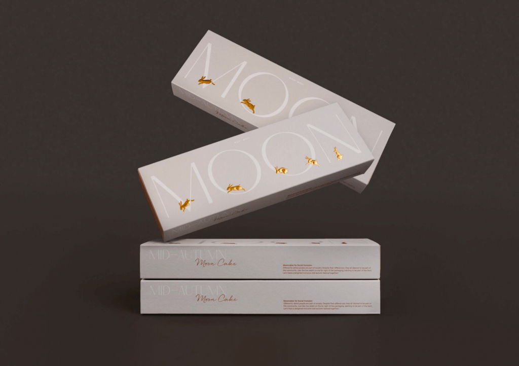
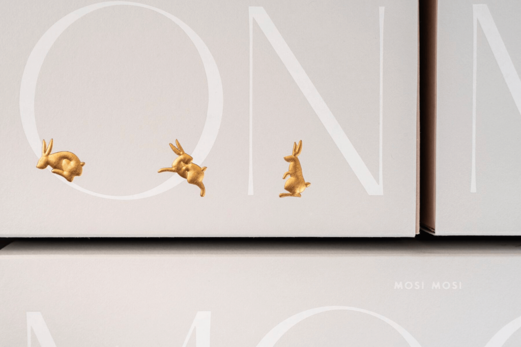
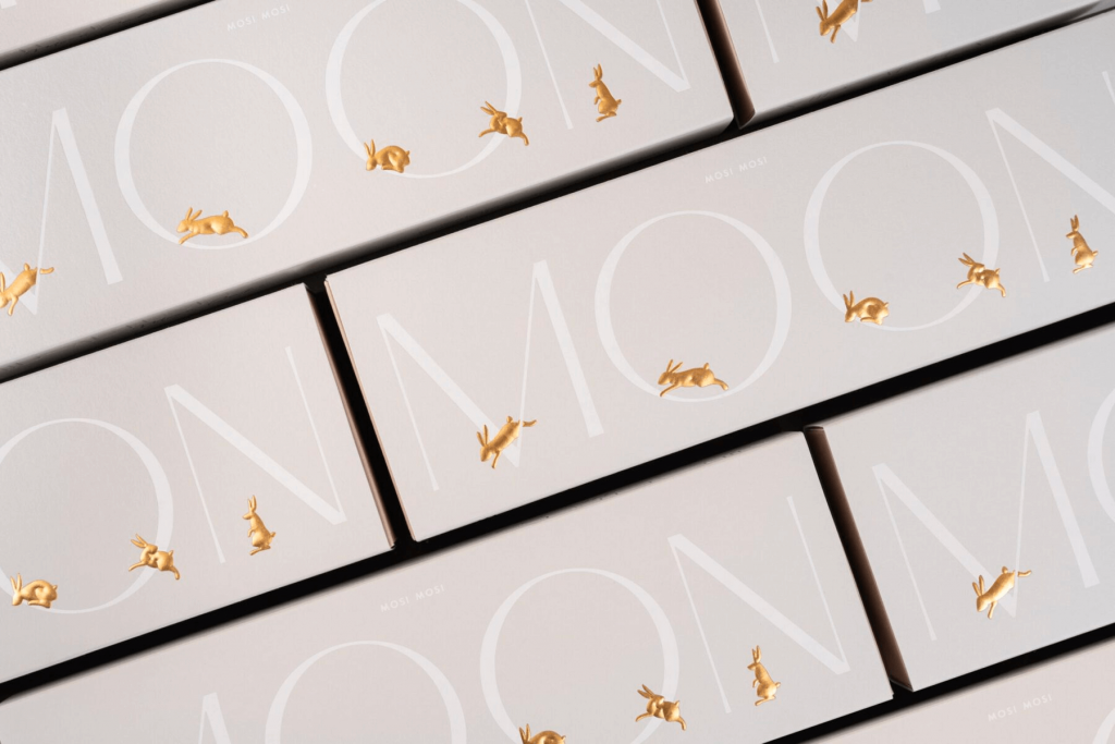
Inclusivity is all about inviting the other, embracing our differences and bridging perspectives. John Lee is an artist diagnosed with autistic spectrum disorder and anxiety disorder since a young age. This collaboration between John and Comma Leung & Frank Lo takes minimalism to a whole new symbolic level.
Through the subtle but powerful use of color and the metaphor of “rabbits as people”, we can see how the rabbit on the right stays still while the others hop to the other side of the package. Next to the furthest right rabbit, the one closer to it turns around and invites “the other” to join them.
Meaningful packaging gives a clear message without undermining its usefulness or commercial purpose. It becomes a shared symbol.
Iconic and contemporary in every sense
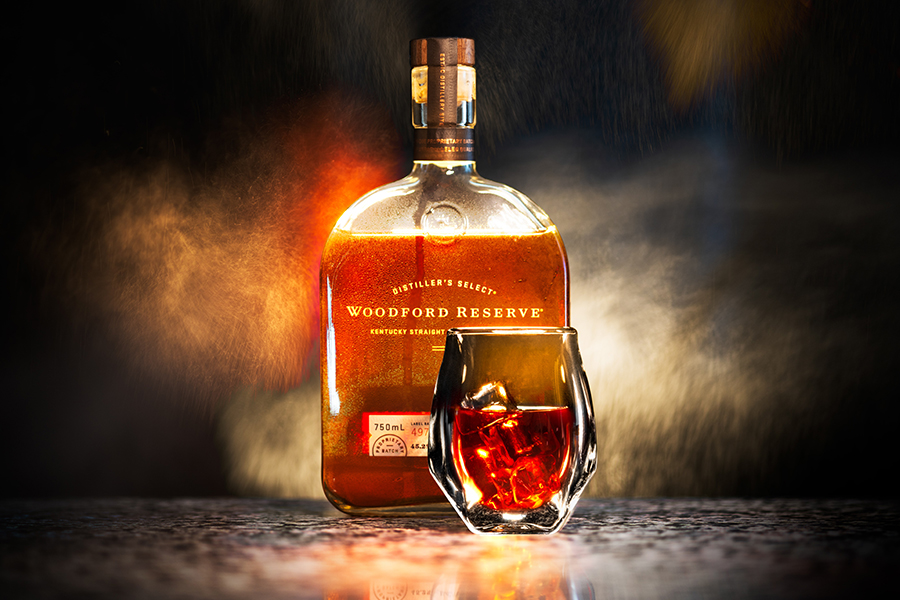
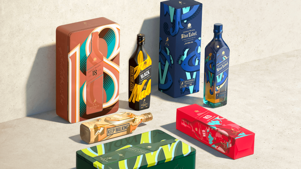
An iconic brand like Johnny Walker has the challenge to stay relevant in an ever-changing landscape while staying true to its roots. While traditionally conservative in its branding and packaging, choosing a different asset for every label with such a fiercely playful color palette, they embrace a culture where everyone strives to be unique: Red is Confident and Dynamic, Black is Bold and Profound, Blue is Complex and Elevated. Pairing multiple products is also encouraged through a careful selection of patterns and colours.
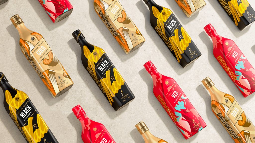
This unapologetic move is also contemporary in a different way, with all primary and secondary packs (except Blue) now fully recyclable. And it worked: sales went up 106% compared to last year and it reinvigorated the Johnny Walker brand for a younger generation. But what’s most impressive is how you can still feel the “Keep Walking” mantra that defined Johnny Walker for more than a century. Truly special.
Does your creative food packaging packaging follow the form or the symbolic function? We hope these packages inspire you to be meaningful and bold. They certainly inspired us.