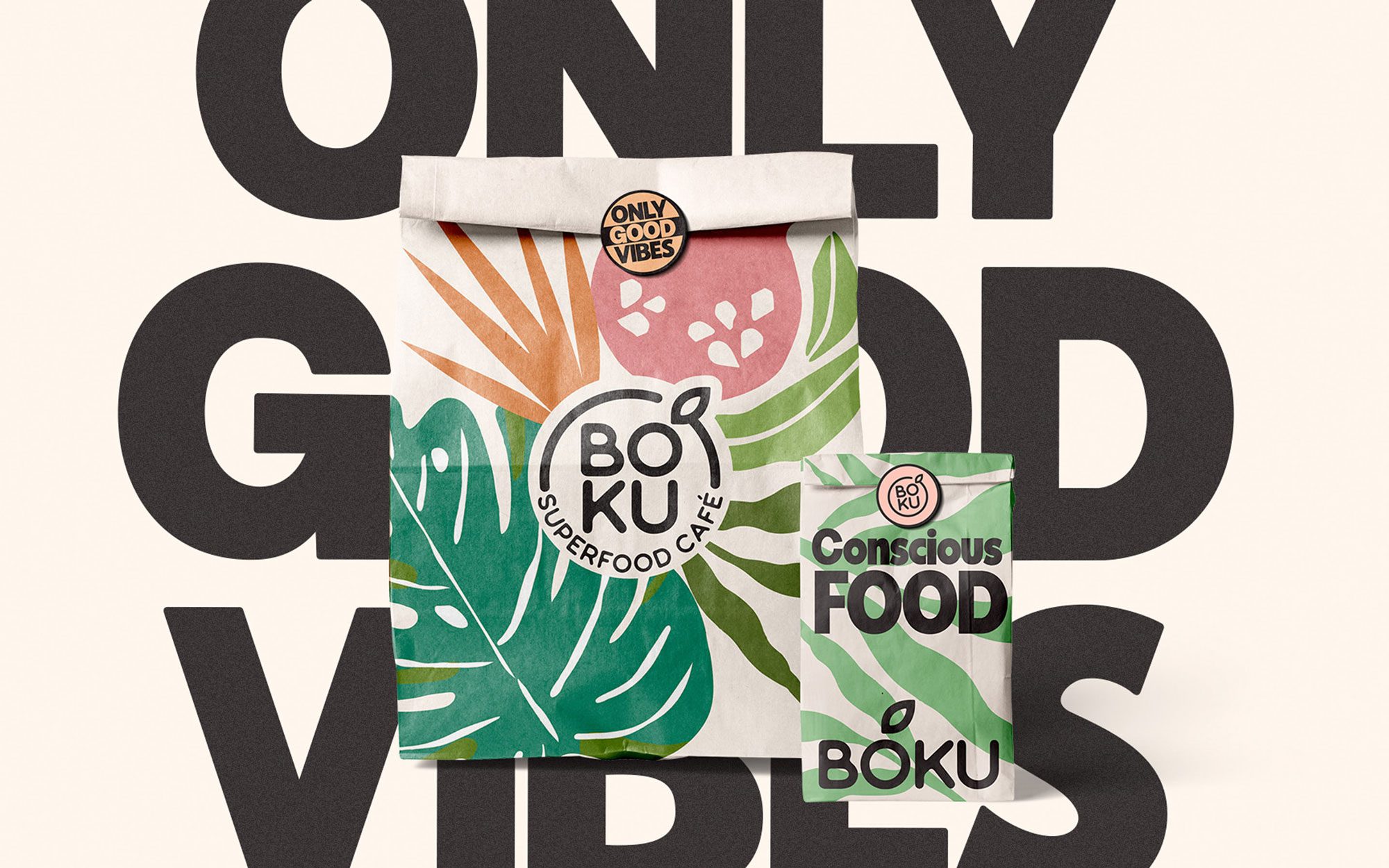
Boku is more than a supplement—it’s a lifestyle rooted in health, energy, and natural awareness. Our challenge was to redesign its visual identity from the ground up, creating a coherent and flexible brand system with strong editorial presence
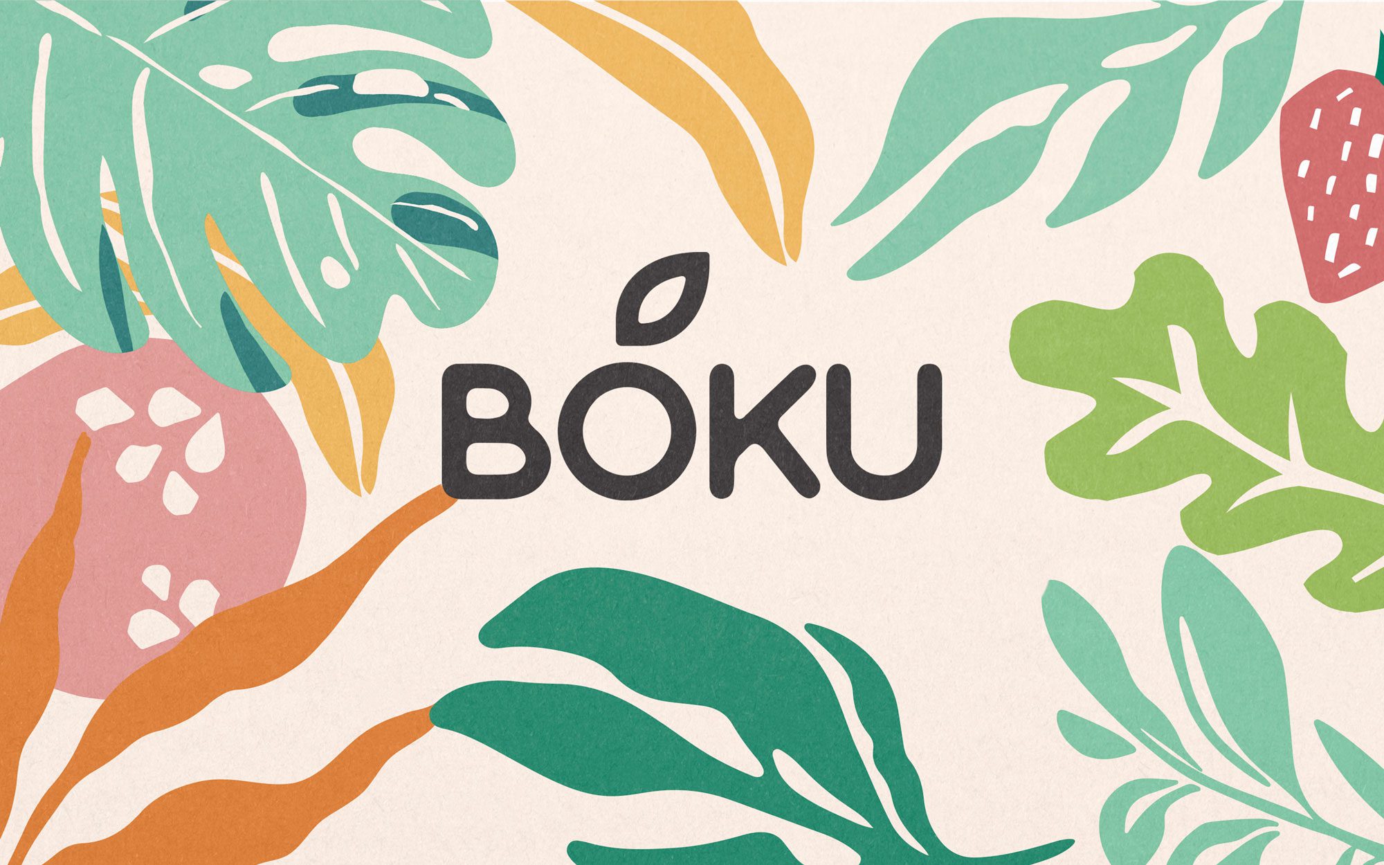
Typographic and structural clarity: we redesigned the logotype, refined kerning, spacing, and visual hierarchy.
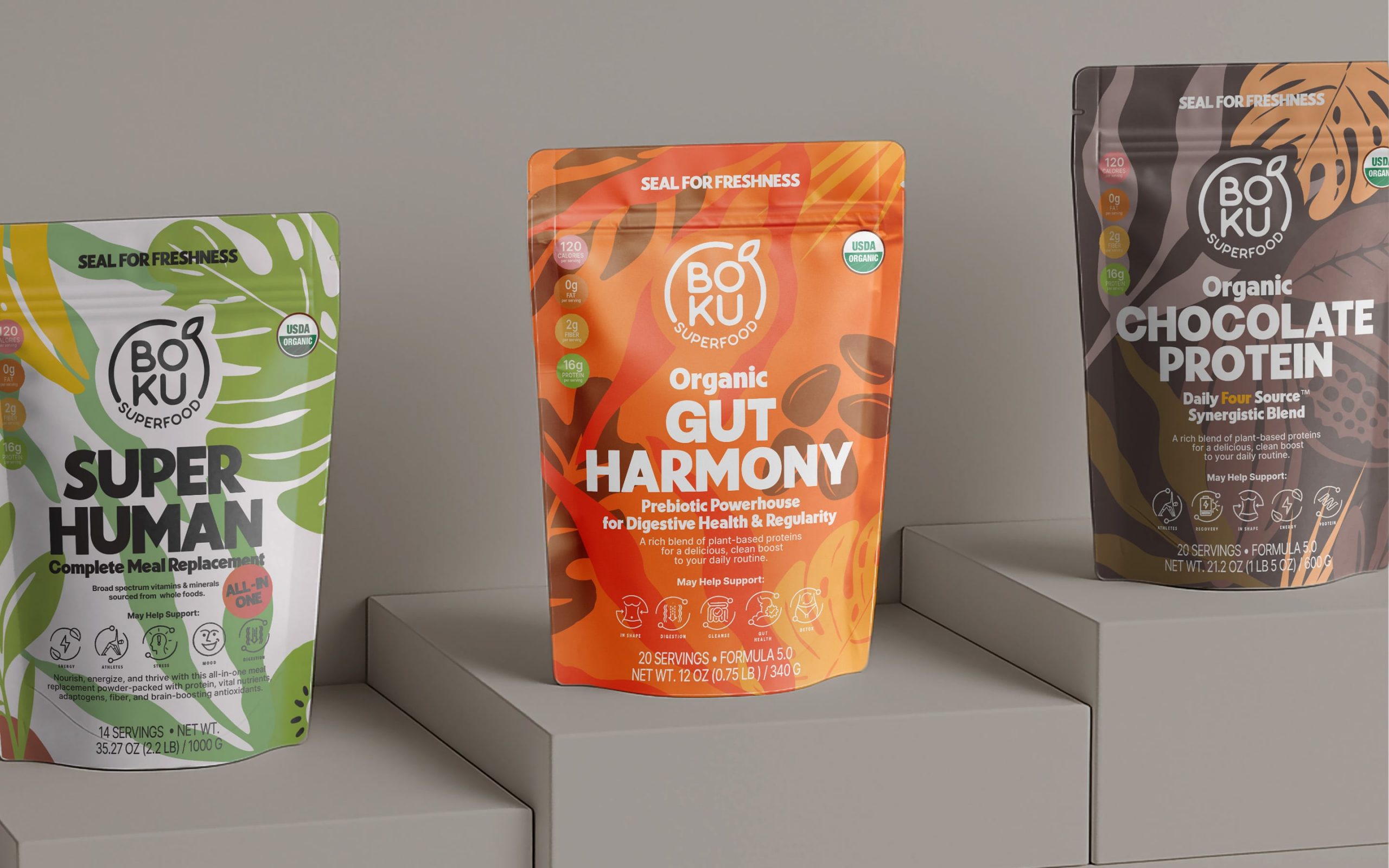
Brand architecture: we structured sub-brands and ranges using a color system inspired by sensations and blends, not categories.
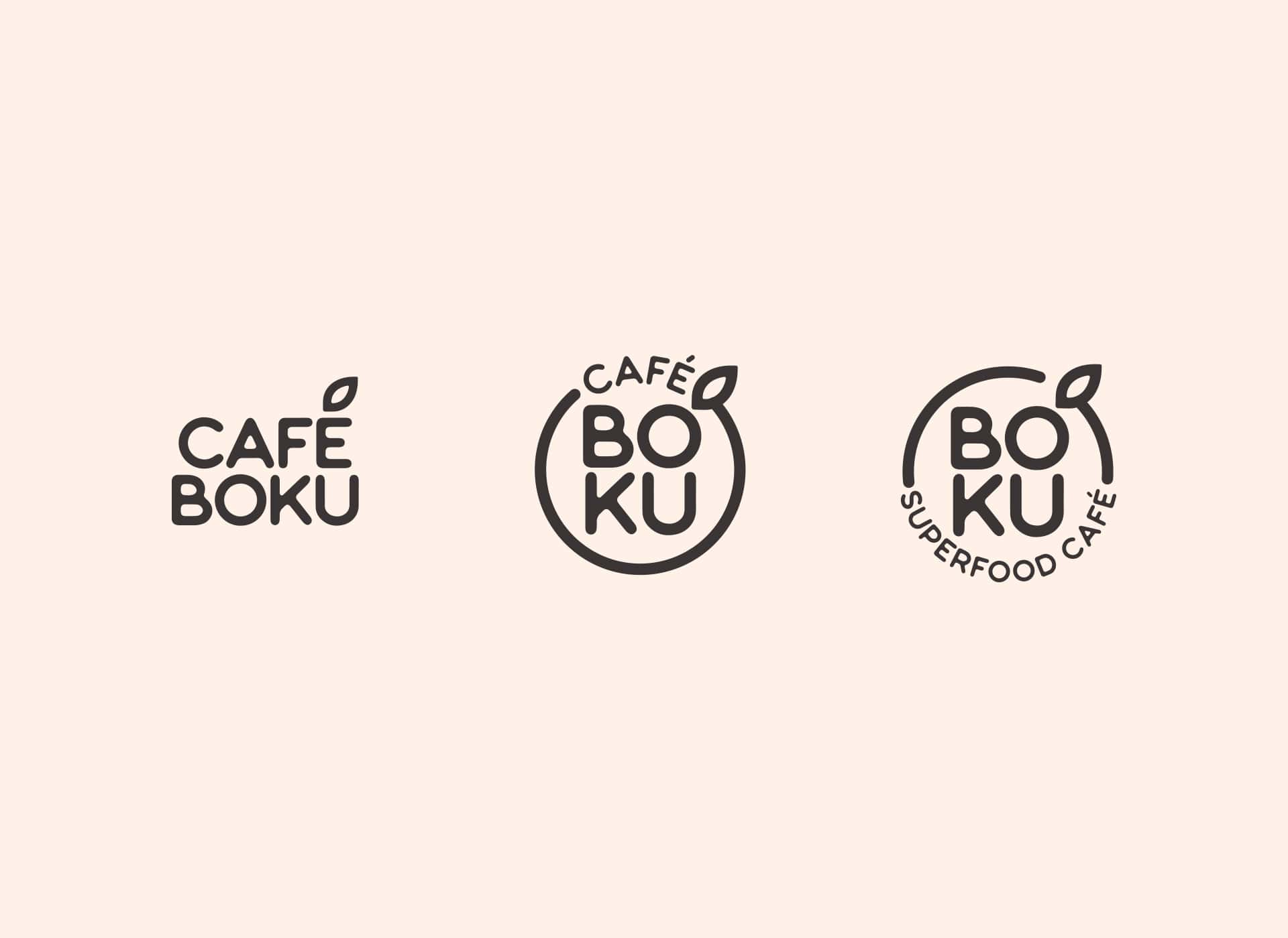
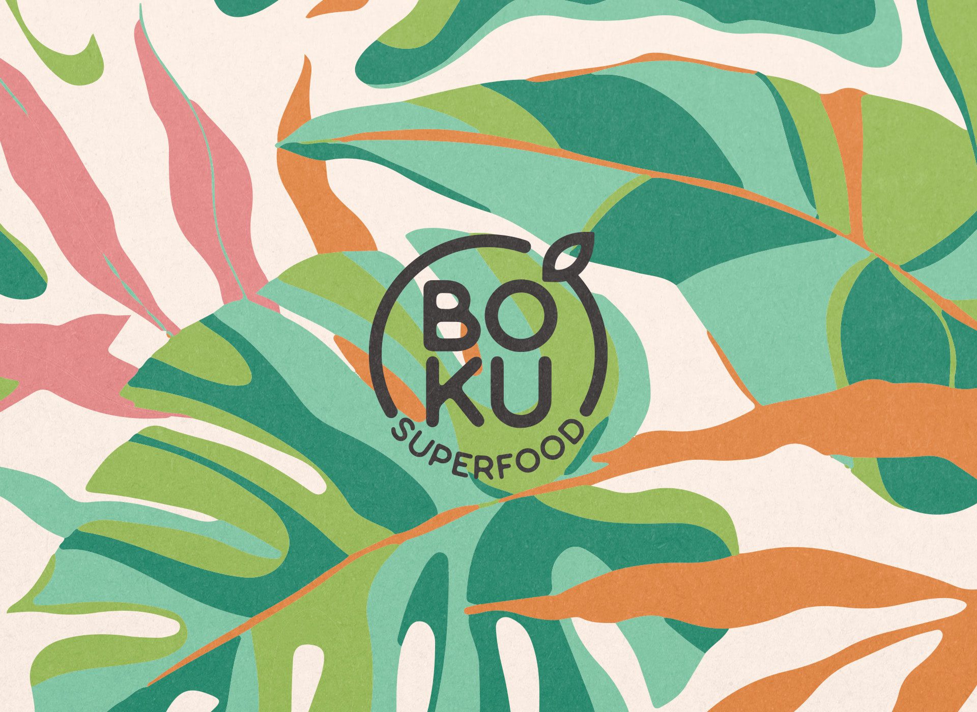
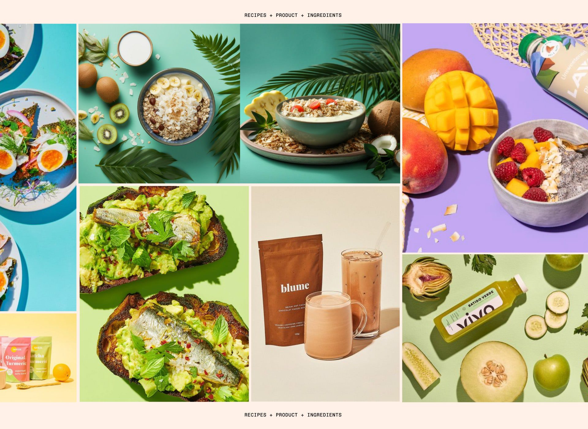
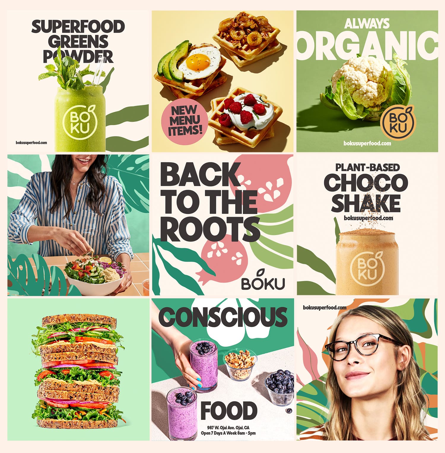
Art direction & visual storytelling: we introduced illustrative elements that evoke a holistic world—ingredients and nature merged with a warm, contemporary aesthetic.
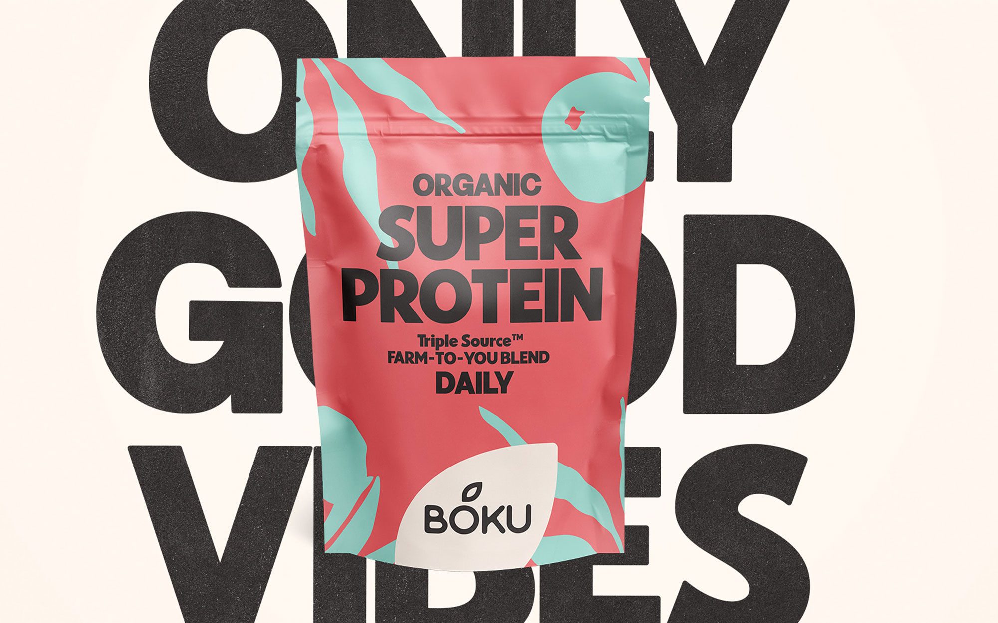
Packaging design: we developed the full packaging line, establishing clear categorization, visual hierarchy, and an adaptable system for future product expansions.
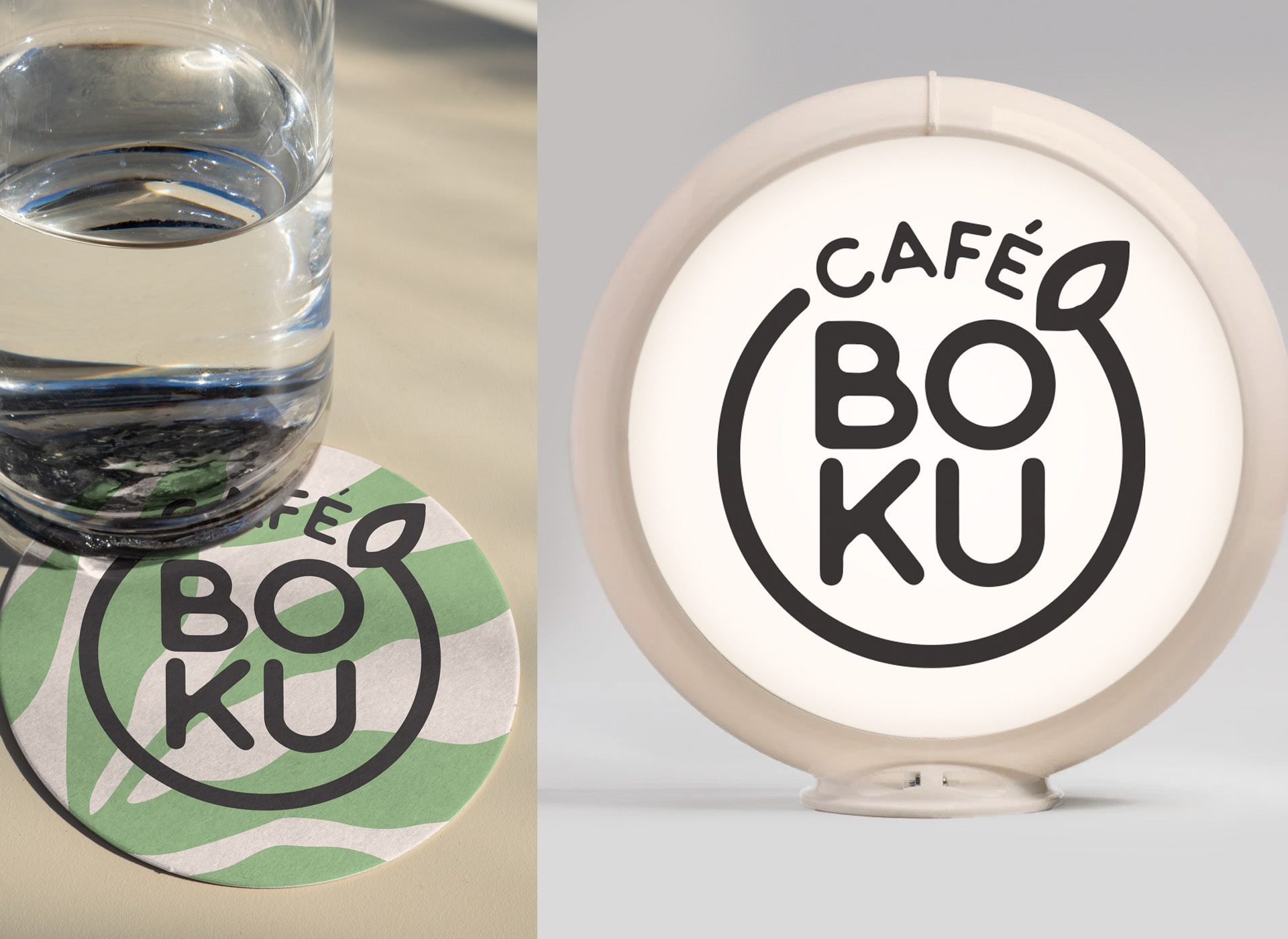
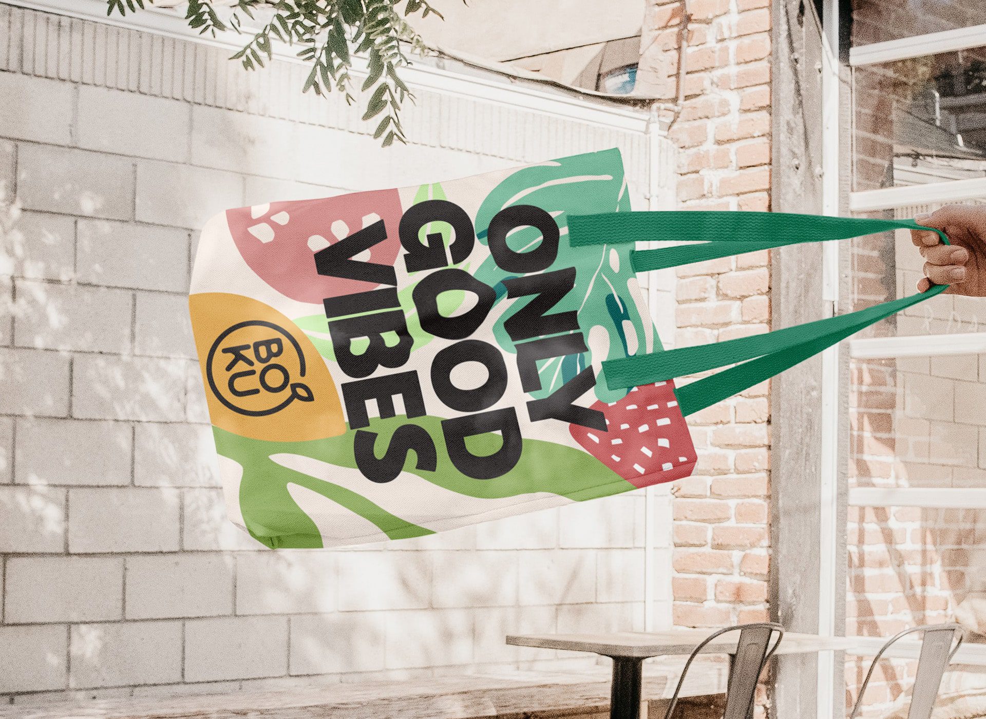
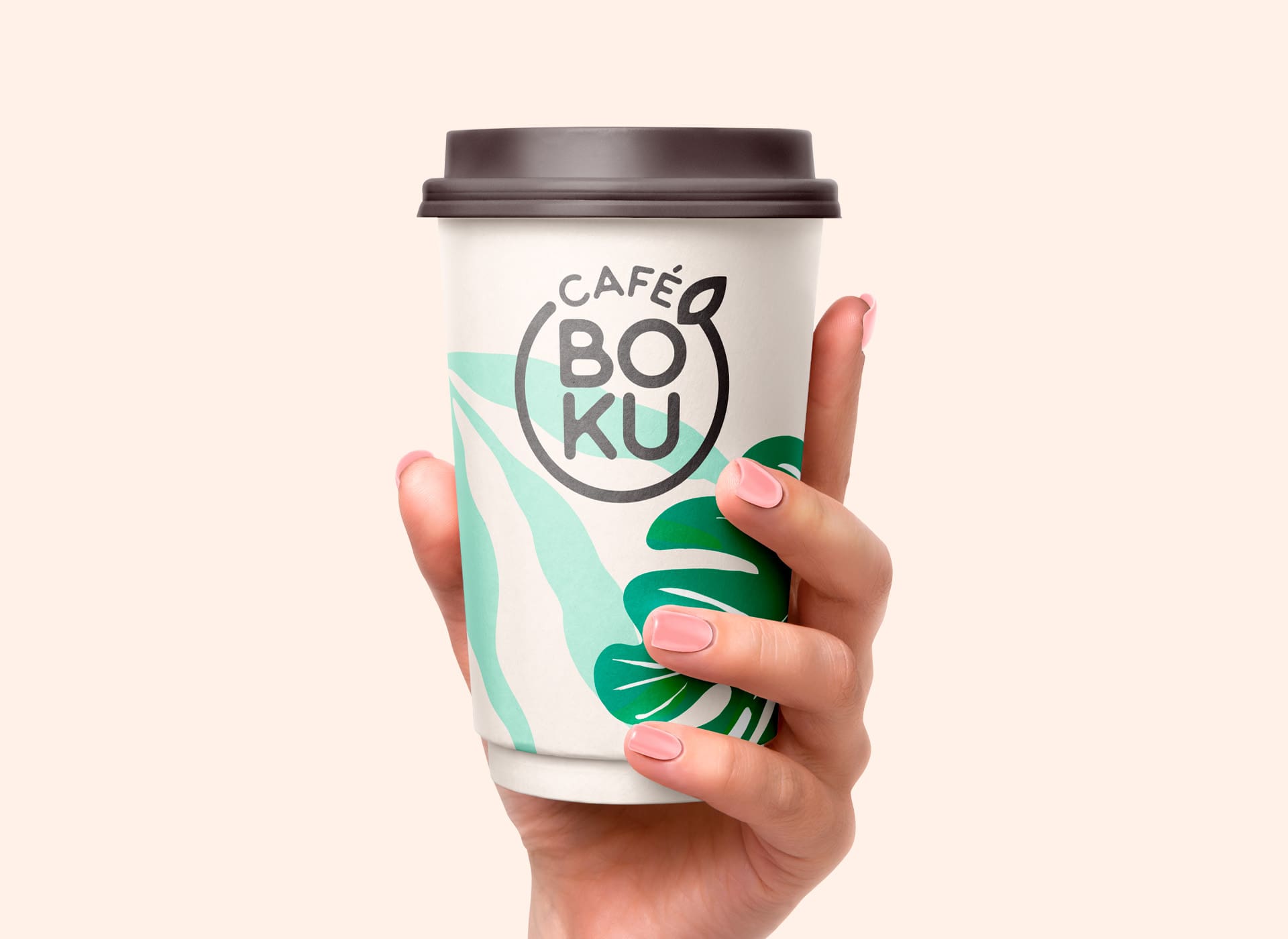
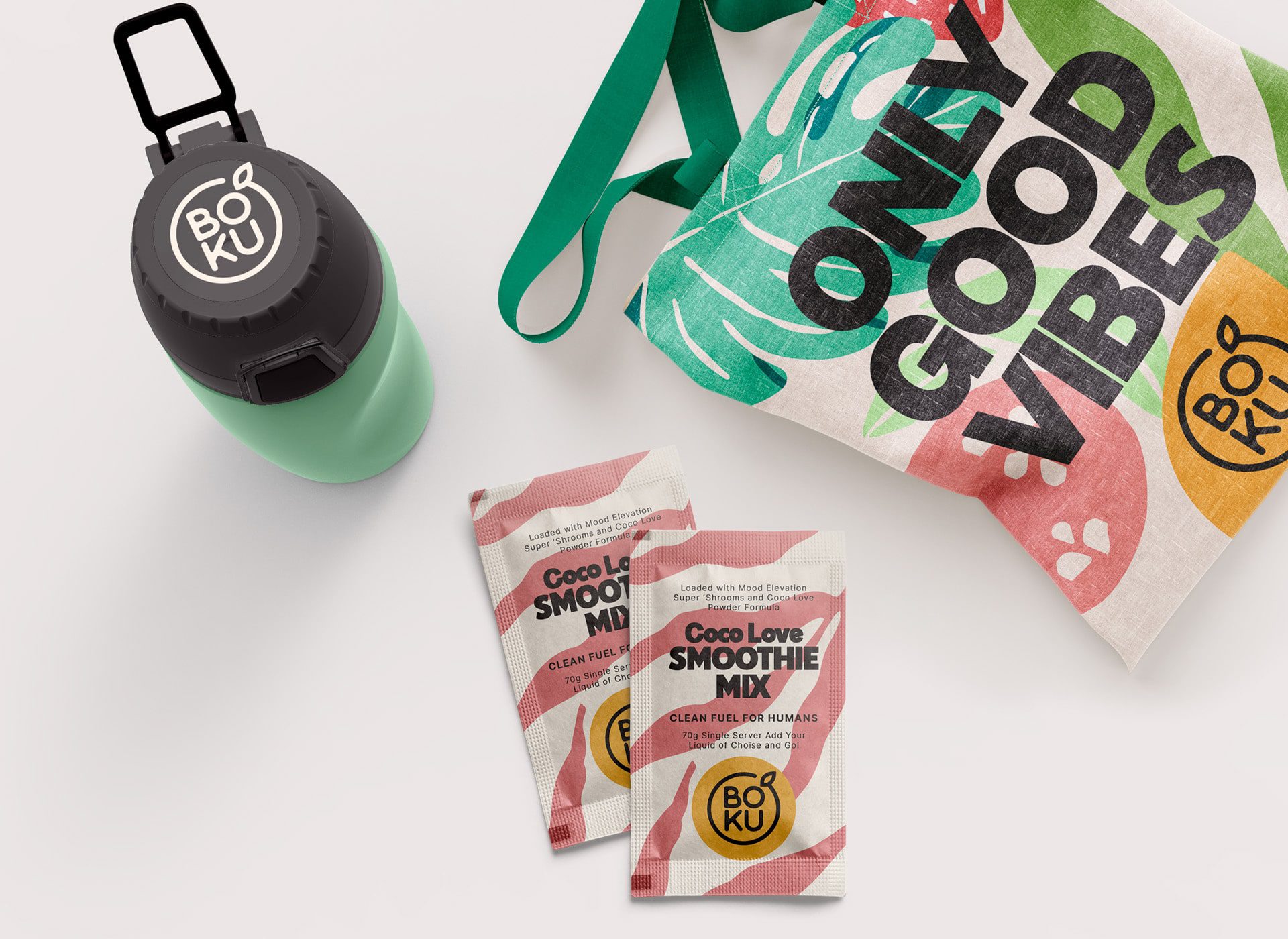
A renewed identity that radiates wellness, authenticity, and vitality, with a visual language that connects instantly with a conscious and global audience.
