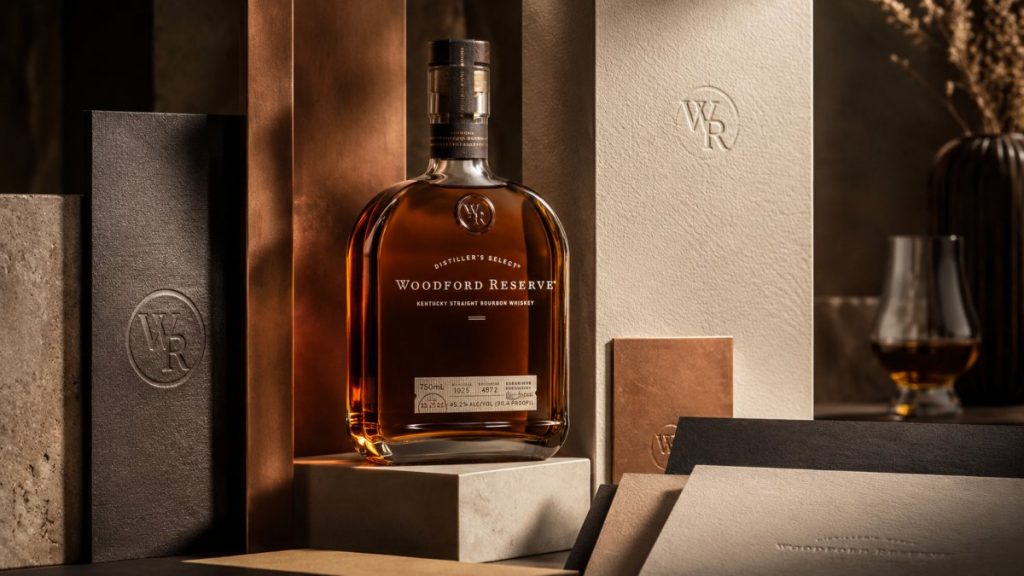
A bottle of high-end bourbon is never just a vessel; it’s a silent brand ambassador that must justify a premium price point before the first drop is ever poured. The packaging woodford utilizes is a masterclass in this principle, blending architectural weight with sensory storytelling to create a physical manifestation of its internal essence. You likely recognize the challenge of standing out on a crowded shelf where generic designs often fail to convey the true value of a premium product. It’s difficult to balance the heavy weight of tradition with the modern necessity for sustainable innovation, such as the recent transition of smaller formats to 100% recycled materials.
This case study reveals how the strategic design and material choices of Woodford Reserve define the standard for luxury spirits branding. You’ll gain a deep understanding of the structural and psychological elements that turn raw materials into an experience of prestige. We will examine how a clear vision, expert production, and tactile differentiation work together to build, organize, and refine a brand’s physical presence. By the end, you’ll see why the right design partner is essential for translating abstract heritage into a tangible, high-end reality that consumers can feel, hold, and trust.
Conclusiones clave
- Discover how architectural glass structures move beyond mere containment to establish a sense of permanence, authority, and shelf weight.
- Uncover the sensory psychology behind the packaging woodford employs; focus on how specific paper stocks and foil finishes communicate craft through touch.
- Learn to utilize the “Legacy Effect” to bridge the gap between historical heritage and modern aesthetic excellence through strategic visual identity systems.
- Master the balance of sustainable innovation and premium perception by exploring new material bases that honor both the earth and the brand’s internal essence.
- Understand the necessity of a design partner who can unify high-level strategy, artistic vision, and meticulous production management.
The Woodford Aesthetic: A Case Study in Premium Spirits Packaging
Luxury packaging is the physical manifestation of a brand’s internal essence. It’s a silent dialogue between the creator and the connoisseur, where every detail is a deliberate choice. For many spirits, the container is an afterthought, a functional necessity to transport liquid from the distillery to the glass. However, the packaging woodford presents to the world operates on an entirely different plane. It treats the bottle as a piece of architecture rather than a mere vessel. This design philosophy moves beyond utility to establish a structural base of authority, presence, and permanence.
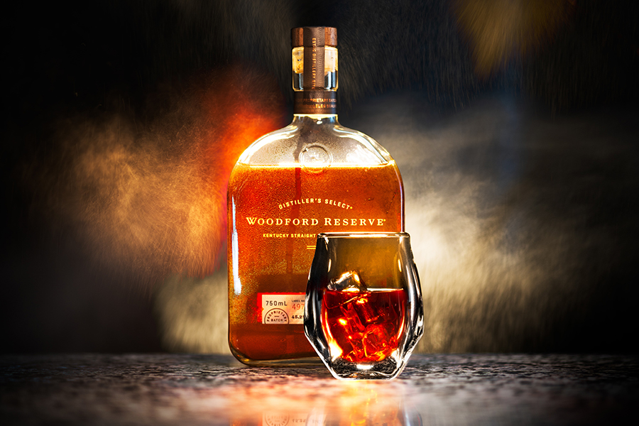
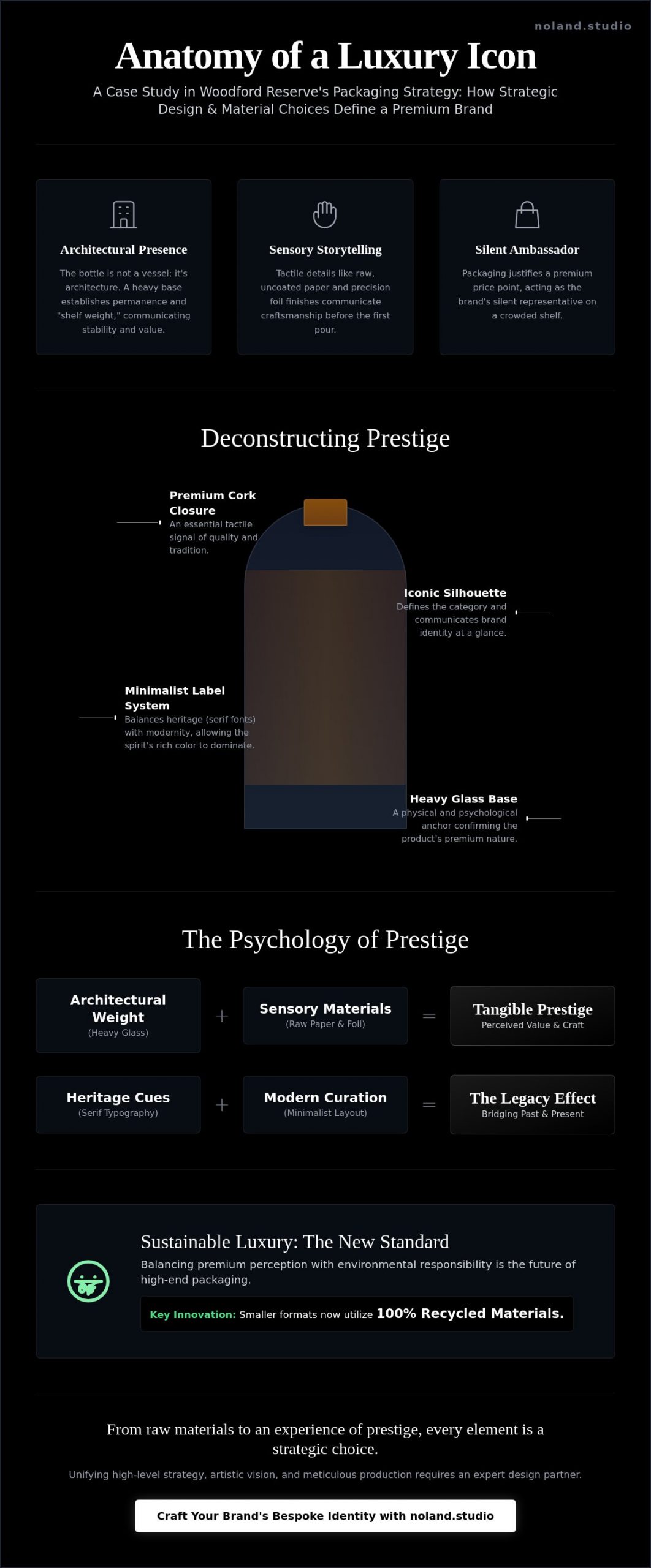
In high-end retail environments, a bottle acts as a silent brand ambassador. It must command attention without shouting. The Woodford Reserve silhouette achieves this through a deliberate sense of shelf weight. By grounding the design in a heavy-base structure, the brand communicates stability and value before the consumer even reads the label. This transition from a functional object to a collectible piece of art direction is what separates premium spirits from their mass-market counterparts. Understanding the Woodford Reserve brand history reveals a trajectory of constant refinement. Every glass curve and copper foil finish is a calculated move to inspire, engage, and endure. The 2016 redesign, executed by Studio MPLS, solidified this approach by introducing updated bottle structures and cork closures that emphasize tactile prestige.
The Anatomy of a Luxury Spirits Bottle
The silhouette of a bottle defines its category at a glance. In the world of premium bourbon, structural integrity is paramount. High-end spirits packaging relies heavily on glass clarity and thickness to signal quality. A thick glass base doesn’t just provide physical stability; it creates a visual anchor. When a consumer reaches for the bottle, the weight provides immediate psychological feedback. It confirms the “expensive” nature of the product. This tactile prestige is a primary driver in the purchase journey, turning a moment of curiosity into a moment of conviction through weight, texture, and light.
Heritage vs. Modernity: The Design Balance
Balancing traditional heritage with modern aesthetic excellence is a delicate process of growth and refinement. Woodford Reserve utilizes typography to evoke historical authority, using serif fonts that feel etched rather than simply printed. These traditional cues are balanced by a minimalist labeling strategy. By keeping the labels small and precisely placed, the design allows the rich, amber color of the spirit to drive the narrative. It’s a process of curation and organization. The result is a visual identity that feels centuries old yet remains perfectly at home in a contemporary global market. This expert-led craft ensures that the packaging woodford uses remains a benchmark for the industry, proving that true luxury is felt as much as it is seen.
Decoding the Tactile Experience: Materiality and Craftsmanship
Touch provides a direct conduit to a brand’s soul. While visual cues capture attention from a distance, it is the physical interaction that solidifies a consumer’s perception of value. The packaging woodford presents to the world is designed to be felt as much as seen. This tactile prestige is not accidental. It is the result of a rigorous process to build, organize, and refine the sensory experience. Texture is truth. When a hand closes around the bottle, the brain immediately decodes the weight of the glass and the grain of the paper as markers of high-level craftsmanship.
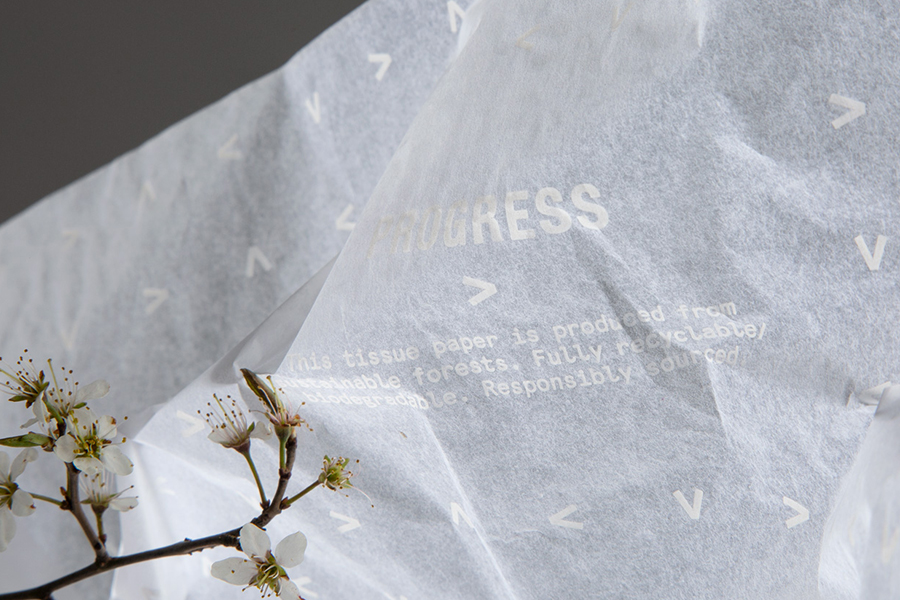
Materiality serves as the foundation of this silent dialogue. The choice of paper stock is particularly telling. By utilizing uncoated, raw-touch papers, the brand establishes a connection to the earth and the distillery’s heritage. This organic base is then juxtaposed with the precision of copper or gold foil. This contrast between the rugged and the refined creates a multi-dimensional identity. Industry shifts toward sustainable and experiential packaging confirm that modern connoisseurs seek these meaningful, sensory connections. If you are looking to elevate your brand’s physical presence, exploring diseño de empaque premium can transform a simple container into a visionary statement.
The closure system acts as the crescendo of the brand experience. The “opening ritual” begins with the sound and feel of the cork. A high-quality cork provides a specific resistance and a resonant “pop” that signals the start of a premium experience. Maintaining this level of tactile quality at a global scale requires meticulous production management. Every batch must meet the same exacting standards to ensure the brand’s essence remains intact from Kentucky to Tokyo.
The Unboxing Ritual in Premium Spirits
The experience often begins before the bottle is even touched. Secondary packaging, such as limited-edition gift boxes, creates a curated space for the brand narrative to unfold. By incorporating internal textures and hidden details, the design rewards the discerning buyer for their attention. This process gives physical form to abstract thoughts, turning a transaction into a moment of discovery. It links the physical act of unboxing to a larger story of transformation and excellence.
Labels and Foil: The Jewelry of Packaging
If the bottle is the architecture, the labels are the jewelry. Embossing and debossing techniques are used to create a landscape of ridges and valleys that encourage fingers to linger. Metallic accents are applied with strategic restraint to signal exclusivity. Sourcing these materials requires a balance of luxury and responsibility. The transition to sustainable yet premium labeling materials ensures that the brand remains visionary, protecting its legacy while embracing the future of expert-led craft.
The Psychology of Prestige: Why Woodford Packaging Commands a Premium
Perception is the primary currency of the luxury market. When a consumer encounters a bottle of spirits, their brain performs a series of rapid, subconscious evaluations before a single drop is tasted. The packaging woodford utilizes is meticulously engineered to exploit these cognitive heuristics. Human psychology often translates physical weight into perceived quality. A heavy glass base suggests stability, craftsmanship, and a superior liquid. This is not merely a design choice; it is a strategic manifestation of authority. By grounding the brand in physical substance, the packaging creates an immediate sense of trust and excellence.
This sense of prestige is further amplified by the “Legacy Effect.” Through the use of specific textures and structural silhouettes, the design suggests a heritage that feels centuries old, regardless of the brand’s actual chronological age. It is a process of giving physical form to an abstract history. This curated authority allows the bottle to act as a potent social signal. In the home bar environment, the vessel becomes a status symbol, a piece of functional art that communicates the owner’s discernment and taste. Research into how luxury alcohol packaging Shapes Consumer Perceptions confirms that these visual and tactile cues are fundamental to establishing an emotional connection with the buyer.
Skeptics might view premium packaging as a secondary cost. In reality, it is a strategic investment in brand equity. The structural and material choices are what allow a brand to command and sustain a premium price point. Without this physical prestige, the liquid remains a commodity. With it, the product becomes an experience. This transformation is driven by expert-led craft, ensuring that every element—from the weight of the glass to the grain of the label—works to build, organize, and refine the brand’s position in a crowded global market.
Narrative Architecture in Design
A successful visual identity requires a strong foundation in Denominación e identidad verbal to support its physical weight. Every design choice must tell a consistent story. Font selection, seal placement, and even the wording on the back label are part of a broader narrative architecture. This consistency creates emotional resonance, which is the cornerstone of long-term brand loyalty. When the verbal and visual identities align, the brand moves beyond a simple transaction to become a meaningful part of the consumer’s lifestyle.
The Science of Shelf Presence
Standing out in a “sea of glass” requires a deep understanding of color theory and structural contrast. Amber-colored spirits present a unique challenge; they require label colors and foil accents that complement the liquid while maintaining legibility. A unique structural silhouette ensures the bottle is recognizable even from a distance. In the digital age, this shelf presence must also translate to high-performance e-commerce sites. The packaging must look as evocative on a mobile screen as it does in a physical boutique, requiring a multidisciplinary approach that blends 3D visualization with traditional craft.
Sustainable Luxury: The Future of High-End Packaging Systems
The enduring belief that physical weight equates to superior quality is a heuristic that designers must now navigate with extreme discernment. While previous sections explored how the heavy-base bottle establishes authority, the future of luxury requires a more nuanced approach. The packaging woodford produces is already leading this shift. In December 2024, the brand began transitioning its 50ml bottles to 100% post-consumer recycled (PCR) plastic. This single move is expected to eliminate 101 metric tons of virgin plastic annually and reduce greenhouse gas emissions for that format by 30%. It proves that luxury can be both evocative and responsible without losing its aesthetic excellence.
True transformation in the spirits industry involves moving beyond the “heavy bottle” myth. Innovations in lightweight luxury glass allow brands to maintain a sophisticated silhouette while significantly lowering their carbon footprint. This evolution is supported by the use of recycled paper stocks that retain a premium, tactile grain. Woodford Reserve already recycles 99% of its waste across all operations, setting a benchmark for how heritage brands can build, organize, and refine their environmental impact. The concept of the “forever bottle” is also gaining traction, where the primary vessel is designed for longevity and supplemented by sophisticated refill systems.
Material Innovation in 2026
The landscape of luxury materials is expanding to include bio-based resins and mycelium-based secondary packaging. These organic structures offer a unique sensory experience that rewards the touch while remaining entirely biodegradable. We are seeing a decisive shift toward plastic-free closures and foils that do not compromise on the gold-standard shimmer consumers expect. By giving physical form to these sustainable visions, brands can inspire a new generation of conscious connoisseurs who value both internal essence and external impact.
Production Management and Global Sourcing
Navigating the complexities of Diseño de empaque premium in a circular economy requires a multidisciplinary approach. It’s about more than just sourcing; it’s about ensuring ethical labor practices and supply chain transparency across a global network. We utilize advanced 3D visualization to prototype these sustainable systems, reducing physical waste during the design phase. AI now plays a critical role in optimizing supply chains for sustainable materials, yet the final discernment remains guided by expert hands. If you are ready to redefine your brand’s physical presence for a sustainable future, explore our strategic design services para comenzar tu transformación.
Shaping the Future: How Noland Studio Crafts Bespoke Identities
Identity is felt. At Noland Studio, we operate as a multidisciplinary collective of digital artisans, curators of identities that are meant to be felt as much as they are seen. We don’t merely design containers; we build structural bases for brands to inhabit. By merging high-level Estrategia y posicionamiento de marca with meticulous physical craft, we give physical form to abstract thoughts. The architectural weight and tactile prestige seen in the packaging woodford uses serve as an industry benchmark for the level of intentionality we bring to every project. Our process is a transformative journey, moving from the internal essence of a vision to a physical manifestation that commands authority.
Precision is paramount. We utilize 3D visualization and AI-enhanced tools to refine packaging concepts before the first physical prototype is ever created. This technological edge allows us to explore complex structural silhouettes and material contrasts with a level of precision previously unattainable. In our hands, AI is not a replacement for craft but a tool for discernment. It helps us optimize the supply chain and test sustainable material systems while the final aesthetic decisions remain guided by expert hands. This intersection of modern innovation and traditional expertise ensures that every project achieves a sense of aesthetic excellence and strategic purpose.
The Digital Artisan Advantage
Our distributed network of global experts provides a sensitive, localized touch that transcends the boundaries of traditional agency models. We integrate Dirección de arte y creación de contenido throughout the entire packaging lifecycle. This ensures that the story told on the screen matches the experience of the bottle in the hand. By treating every project as a piece of curated art, we create a living visual universe where visual identity systems and physical vessels exist in perfect, rhythmic harmony. Our experts act as a bridge between the abstract world of ideas and the physical world of products.
Building Soulful Brands
Luxury is defined by longevity and emotional resonance rather than fleeting trends. We focus on creating brands that possess a soul, identities that inspire and endure. Our consultation process is a guided tour through a curated space of ideas, where we act as both mentors and creators. We help you navigate the complexities of premium design to find the internal essence of your brand. This measured pace reinforces our positioning within high-end sectors where time and consideration are valued. To begin your transformation and manifest your vision into a physical reality, contact Noland Studio for a sophisticated strategic consultation.
Defining the Future of Physical Identity
The physical manifestation of a brand’s internal essence is its most enduring legacy. We’ve explored how the strategic choices behind the packaging woodford presents to the world, from architectural glass structures to sustainable transitions in recycled materials, establish a global benchmark for the spirits industry. True luxury requires a delicate balance of heritage, sensory psychology, and visionary innovation. It’s about building a structural base that consumers can feel, hold, and trust. By organizing these elements into a cohesive visual identity, a brand moves beyond a simple product to become a piece of functional art.
At Noland Studio, we act as a bridge between your abstract ideas and the physical world. Our multidisciplinary collective of digital artisans combines global reach with a sensitive, localized touch. We merge high-level luxury strategy with premium materiality, utilizing AI-enhanced tools to refine every detail before it takes physical form. This expert-led craft ensures your brand doesn’t just exist; it inspires. It’s time to move beyond the generic and embrace an identity that is truly soulful. Comienza la transformación de tu marca con Noland Studio. and give physical form to your most ambitious visions. Your journey toward aesthetic excellence starts with a single, intentional step.
Preguntas frecuentes
What is the significance of the Woodford Reserve bottle design?
The design represents a shift from a simple container to a piece of deliberate architecture. By prioritizing a heavy base and a unique structural silhouette, the brand established a new visual language for the super-premium bourbon category. The 2016 redesign solidified this presence, using updated bottle structures and high-quality paper labels to communicate a sense of permanence and authority that defines the brand’s position in the global market.
How does packaging affect the perceived value of premium spirits?
Packaging serves as a psychological heuristic that translates visual and tactile cues into a signal of quality. When a vessel feels substantial and looks meticulously crafted, the brain automatically associates the product with a higher price point. This process allows a brand to justify premium pricing by creating a physical manifestation of its internal essence, ensuring the consumer feels the value before the first pour.
Can luxury packaging be sustainable without losing its premium feel?
Luxury can absolutely embrace responsibility through the use of high-end recycled materials and bio-based resins. The transition of the 50ml format for packaging woodford to 100% post-consumer recycled plastic is a prime example. This change reduces environmental impact while maintaining the brand’s aesthetic excellence. Modern design focuses on building structural bases that honor the earth without compromising the sensory impact that defines a high-end experience.
What materials are commonly used in high-end spirits packaging?
Designers typically select high-clarity flint glass, uncoated paper stocks, and metallic foils to create a multi-sensory landscape. These materials are often accented with natural cork closures and copper or gold finishes. The goal is to create a contrast between raw textures and refined details. This combination of materials rewards the touch and encourages the consumer to explore the bottle’s surface, reinforcing a narrative of expert-led craft.
Why do brands use heavy glass for luxury products?
Heavy glass provides immediate tactile feedback that the subconscious mind associates with stability and prestige. This visual and physical “shelf weight” anchors the product in the consumer’s hand, creating a sense of authority. While the industry is exploring lightweight alternatives for sustainability, the use of substantial glass remains a potent social signal. It communicates a legacy of quality and a commitment to enduring impact in a crowded retail space.
How does Noland Studio approach spirits packaging design?
We act as curators of identities, merging visionary brand strategy with meticulous physical craft. Our multidisciplinary approach involves a deep dive into a brand’s soulful vision before moving to 3D visualization and production management. We bridge the abstract world of ideas and the physical world of products. This ensures that every visual identity system we create is both strategically sound and emotionally resonant for a global audience.
What is the “unboxing ritual” in luxury branding?
The unboxing ritual is a curated sequence of sensory interactions designed to reward a buyer’s discernment. It utilizes secondary packaging, hidden internal details, and specific textures to transform a transaction into a moment of discovery. By giving physical form to a brand’s story, this ritual builds a deeper emotional connection. It turns the act of opening a bottle into a transformative process that secures long-term brand loyalty.
How can AI-enhanced tools improve physical packaging design?
AI tools provide unprecedented precision in optimizing supply chains and testing structural integrity during the design phase. They allow our digital artisans to prototype complex concepts with speed and accuracy, reducing physical waste. While these tools offer a technological edge, the final discernment always remains guided by expert hands. This intersection of modern innovation and traditional expertise ensures that the final packaging is both visionary and perfectly executed.